Choosing the best paint color for bedroom walls is less about finding one perfect shade and more about creating a room that feels comfortable when you wake up and relaxing when you go to bed. A beautiful color in someone else’s home may look completely different in yours because natural light, artificial lighting, furniture, flooring, and surrounding colors all affect how paint appears.
For many bedrooms, muted blues, soft greens, warm whites, greige, taupe, and other gentle neutrals are dependable starting points. Earthy colors such as clay and terracotta can add warmth, while navy, charcoal, plum, and deep brown can create a darker, more intimate atmosphere.
The right choice also depends on what you want from the room. A small bedroom may benefit from a light, open palette, while someone who wants a cozy retreat may prefer a rich color even in a compact space.
Instead of naming one shade as the winner for every home, this guide explains which colors work well in different bedroom conditions and how to choose one confidently.
Snippet-Ready Definition:
The best paint color for bedroom walls is one that suits the room’s lighting, size, furniture, and desired mood. Soft blues, sage greens, warm whites, greige, and taupe are popular calming choices.
Best Paint Color for Bedroom at a Glance
If you want a simple place to start, think about the feeling you want when you enter the bedroom.
| Color family | General effect | Often works well for |
| Soft blue | Calm and airy | Quiet, light bedrooms |
| Sage green | Natural and relaxed | Rooms with wood and neutral decor |
| Warm off-white | Bright and versatile | Small or simple bedrooms |
| Greige or taupe | Soft and sophisticated | Modern and transitional rooms |
| Cream or mushroom | Warm and cozy | Rooms that feel cold or lack warmth |
| Navy | Deep and enveloping | Cozy or dramatic bedrooms |
| Terracotta or clay | Earthy and warm | Natural, rustic, or layered interiors |
None of these choices is automatically better than the others. Pale colors can make a bedroom feel visually open, while darker colors may create a stronger sense of enclosure and comfort.
Before settling on a family, consider the room at different times of day. A warm cream may look beautifully soft in one bedroom but noticeably yellow in another. Likewise, a blue-gray can appear balanced in bright daylight yet much cooler under certain lamps.
Quick Steps for Choosing a Bedroom Paint Color
- Check natural light — Notice how much sunlight the bedroom receives during the day.
- Consider room size — Light colors can feel more open, while deeper shades create a cozier effect.
- Look at existing finishes — Match the paint undertone with flooring, furniture, curtains, and bedding.
- Choose your desired mood — Try muted blues or greens for softness, neutrals for versatility, or deeper colors for intimacy.
- Test before painting — Sample two or three shades on different walls and view them during both daylight and evening lighting.
Calming Blue Paint Colors for Bedroom Walls
Blue remains a useful starting point for adults who want a bedroom that feels quiet rather than energetic. The most versatile choices are usually softened blues instead of highly saturated or bright shades.
Soft slate blue and dusty blue provide noticeable color without dominating the room. Blue-gray offers an even more restrained look and works well in modern spaces. Muted denim has slightly more depth, while navy creates an entirely different effect: darker, richer, and more enveloping.
A pale blue can help maintain an airy appearance, especially when combined with warm white trim and light-colored bedding. Navy works well when you want the bed and textiles to stand out against a darker background.
These shades are also easy to coordinate. Light wood can soften blue, while walnut adds warmth and contrast. Cream bedding keeps darker blues from feeling too heavy, and crisp white can make muted blue look fresher.
Among calming bedroom colors for adults, gentle blue is therefore worth considering, but personal preference still matters. A color that feels peaceful to one person may feel too cool to another.
Soft Green Bedroom Colors for a Natural, Relaxed Look
Soft green is another flexible option because it can provide color while still behaving much like a neutral.
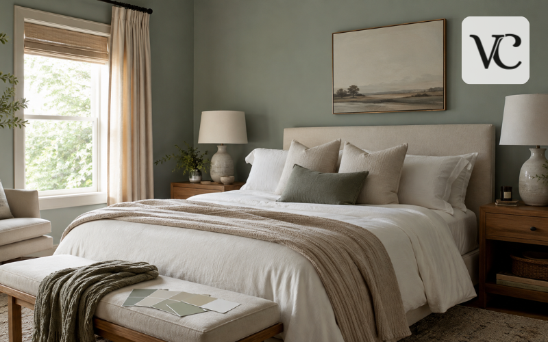
Sage is particularly easy to use with natural materials. It pairs comfortably with oak, linen, rattan, beige fabrics, cream bedding, and warm-white trim. Muted olive has a slightly earthier character, while eucalyptus and gray-green tend to feel softer and more understated.
Lighter greens are useful when you want a fresh bedroom that still feels open. A deeper olive or forest-inspired muted green produces a more intimate result and can work especially well behind a wood or upholstered headboard.
Pay close attention to the undertone, however. Some greens become noticeably yellow in warm sunlight, while blue-green shades may appear cooler in rooms with limited daylight. This is one reason a sample should be viewed directly on the bedroom walls rather than selected from a screen.
The goal is not simply to choose “sage.” It is to find the version of sage, olive, or gray-green that remains attractive in your room’s actual lighting.
Warm Neutral Paint Colors That Are Easy to Live With
Warm neutrals are practical paint colors for bedroom walls because they leave plenty of freedom to change bedding, rugs, artwork, and furniture later.
Warm off-white provides the brightness of white without necessarily feeling as stark as a very crisp white. Cream introduces more warmth. Greige combines elements of gray and beige, while taupe often has more depth. Mushroom, beige, and soft khaki can make a room feel grounded without introducing a strong color.
These shades are especially useful when pure white looks too sharp beside wood furniture, beige carpet, warm flooring, or cream textiles.
Undertones are important with neutrals. What looks like simple beige on a sample card may show pink, yellow, green, or gray once it covers a large wall. Cool gray can also look colder in some bedrooms than expected, which is one reason warmer neutrals have broad appeal.
Warm white works naturally in minimalist rooms, taupe and greige fit many modern interiors, and cream or mushroom can complement traditional and cozy bedrooms.
Earthy and Moody Bedroom Colors for a Cozier Feel
A bedroom does not have to be pale to feel comfortable. Darker and earthier colors can be effective when the goal is intimacy rather than brightness.
Terracotta and clay add warmth without the intensity of a bright orange. Muted burgundy and plum bring richer color, while charcoal, near-black, and deep brown can produce a dramatic background for lighter fabrics and furniture.
Painting all four walls in a deep shade can create a wrapped, cocoon-like look. It tends to work best when the homeowner genuinely enjoys dark rooms and the space has enough lighting to remain practical. A single dark wall may be a better solution when you want contrast without changing the whole atmosphere.
Balance is important. Cream bedding, pale rugs, mirrors, natural wood, linen, and warm lamps can keep deep walls from feeling visually flat or severe.
These colors should be treated as alternatives, not universal recommendations. Some people relax in dark rooms; others prefer the visual freshness of light walls.
Best Bedroom Colors for Sleep and Evening Relaxation
Many searches for the best bedroom colors for sleep produce strong claims about specific colors improving sleep. These claims deserve some caution.
Color can influence how relaxing or stimulating a room feels, and muted blue, gentle green, warm neutrals, and subdued darker shades are commonly associated with calmer interiors. However, wall paint alone should not be treated as a sleep treatment or a guarantee of better rest. Research on color and psychological responses is more complex than simple rules such as “blue makes everyone sleep better.”
Personal preference matters too. Sleep Foundation notes that the most useful bedroom color is ultimately one that helps the individual feel relaxed. More practical features of a sleep environment include keeping the bedroom dark, quiet, and comfortably cool.
Nighttime lighting also matters. Even a beautifully painted bedroom can feel harsh under overly bright lamps.
For a lower-stimulation look, try softened rather than vivid colors and choose a palette you personally find comfortable. Think of paint as one part of the bedroom environment rather than the only factor affecting sleep.
Bedroom Paint Colors for Couples and Shared Bedrooms
Choosing paint for two people can be more difficult because both have to live with the result every day.
Instead of searching for a rigid list of the top 10 bedroom colors for couples, it is more useful to start with broadly adaptable choices. Sage, blue-gray, warm white, taupe, greige, mushroom, muted navy, soft clay, charcoal, and dusty blue all offer different levels of color without requiring the entire room to follow a strong theme.
The easiest approach is for both people to identify colors they definitely dislike first. Then compare the shades that remain under the bedroom’s real lighting.
A shared bedroom also does not require every personal preference to appear on the walls. If one person loves stronger color and the other prefers a quiet room, walls can stay relatively restrained while pillows, artwork, throws, lamps, or a rug carry bolder tones.
This creates flexibility and makes future changes easier than repainting an entire bedroom.
Choosing Bedroom Wall Colors Based on Room Size and Natural Light
Room size matters, but the common rule that every small bedroom must be painted white is too restrictive. Light colors can make boundaries feel less visually heavy, while dark colors can intentionally make a room feel intimate.
Natural light often has an even greater effect on your final choice.
North-facing rooms generally receive cooler, less direct natural light, so cool undertones can become more noticeable. Sherwin-Williams currently recommends considering warmer undertones as a way to balance that cool light.
South-facing bedrooms tend to receive warmer, stronger light for more of the day, which can make warm shades appear richer. East-facing rooms receive stronger morning light and become cooler later. West-facing rooms generally do the opposite, becoming warmer as afternoon light enters.
That changing light explains why one paint chip can seem like several different colors between breakfast and bedtime.
A bedroom with little daylight does not automatically need brilliant white. Warm off-white, mushroom, soft taupe, muted green, or even an intentionally deep shade may produce a more pleasing result. The key is to decide whether you want to increase the feeling of brightness or embrace the room’s naturally cozy character.
Matching Paint Colors With Bedroom Furniture, Flooring, and Bedding
The wall color should work with the features that are already difficult or expensive to replace.
Start by examining the bedroom’s largest permanent surfaces. Light oak usually has warm yellow or beige notes, so sage, warm white, soft blue, and greige can work naturally beside it. Dark walnut offers stronger contrast and can support cream, muted green, dusty blue, taupe, and many deeper shades.
White furniture is flexible, although very cool white furniture can make a creamy wall appear more yellow by comparison. Gray furniture deserves similar care because some grays lean blue while others lean warmer.
Flooring also matters. Warm wood floors often pair easily with earthy or warm-neutral walls. Cooler floors may be more comfortable beside balanced neutrals, blues, or softened greens. Carpet should be considered as part of the color palette, particularly when it covers most of the floor.
Bedding and curtains provide an easy way to connect everything. They do not need to match the walls exactly. In fact, gentle contrast usually creates more depth than using nearly identical colors throughout the entire bedroom.
Sherwin-Williams Bedroom Colors Worth Considering
For readers specifically comparing the best paint color for bedroom Sherwin Williams offers, there are several different directions rather than one obvious winner.
Sherwin-Williams’ current bedroom inspiration specifically highlights Neutral Ground SW 7568 as a warm white, Willowleaf SW 9649 as a green neutral, and Celestial SW 6808 as a cool violet option. Neutral Ground is useful for a soft, light backdrop, while Willowleaf suits an earthy palette. Celestial provides more noticeable color for someone who does not want a conventional neutral.
Other Sherwin-Williams bedroom colors worth sampling include Sea Salt SW 6204, a muted green with blue undertones; Alabaster SW 7008, a balanced white; and Amazing Gray SW 7044, which Sherwin-Williams describes as having warm green-gray undertones.
At the dark end, Tricorn Black SW 6258 can create strong contrast or a deliberately dramatic bedroom.
These examples are starting points, not automatic recommendations. Actual paint can vary from its on-screen representation, so testing the shade in your bedroom remains essential.
Best Paint Color for Bedroom in 2026
The best paint color for bedroom in 2026 does not need to be the year’s most fashionable shade. Bedrooms usually benefit from colors you will still enjoy after a trend has passed.
Current color directions do, however, offer useful inspiration. Warm neutrals and taupes remain relevant, alongside muted pastels, earthy colors, soft greens, and deeper shades.
Sherwin-Williams named Universal Khaki SW 6150 its official 2026 Color of the Year. The company describes it as a mid-tone neutral with a slight yellow undertone. Its importance for bedrooms is not that everyone should paint their walls khaki, but that it reflects the broader movement toward warmer, grounded neutrals.
Sherwin-Williams’ 2026 Colormix forecast is organized around four color directions and includes pastels, warmer sunbaked hues, restorative darks, and foundational neutrals.
For a lasting bedroom, use trends as inspiration rather than instructions. A soft sage, warm taupe, dusty blue, mushroom neutral, clay tone, or deep navy can remain appealing long after 2026 if it suits your room and your taste.
How to Test a Bedroom Paint Color Before Committing
Testing is one of the most useful steps in choosing the best paint color for bedroom walls because undertones often become clearer at a larger scale.
Instead of comparing only one shade, select two or three close options. View them on more than one wall because the wall facing the window may look very different from one across the room.
Check your samples in the morning, afternoon, and evening, then again with your normal lamps turned on. Place them beside the flooring, trim, headboard, curtains, and bedding. This reveals whether a supposedly neutral shade suddenly looks too green, pink, yellow, or gray.
Paint sheen can also influence appearance because different finishes reflect light differently. Compare finishes under the lighting you actually use.
Looking at best color for bedroom walls photos online is useful for gathering ideas, but never treat a photograph as an exact paint reference. Cameras, editing, room lighting, and computer or phone screens can all alter how a shade appears.
Before making the final choice, check four things: the color looks good in daylight, remains comfortable at night, works with the permanent finishes, and still appeals to you after several days of viewing it.
Conclusion
There is no single bedroom paint color that works equally well in every home. Muted blue, sage green, warm off-white, taupe, greige, cream, and mushroom are versatile starting points, while navy, clay, charcoal, and other deeper colors can suit people who prefer a warmer or more enclosed atmosphere.
The best paint color for bedroom walls is ultimately the one that works with your natural light, room size, furniture, flooring, undertones, and personal sense of comfort. Trends can provide inspiration, but the room itself should make the final decision.
Before painting every wall, test your preferred shade in several parts of the bedroom and observe it throughout the day. That simple step can tell you far more than a small color card or an attractive photo online.
FAQs
What is the best paint color for a bedroom?
There is no single best color for every bedroom. Soft blue, sage green, warm off-white, greige, and taupe are versatile choices because they create a comfortable atmosphere and work with many decorating styles.
What are the best bedroom colors for sleep?
Muted blues, soft greens, warm neutrals, and other subdued shades can help create a visually relaxing bedroom. However, paint color alone does not guarantee better sleep, and personal preference remains important.
What color makes a small bedroom look bigger?
Warm whites, pale neutrals, soft blue, and light sage can help a small bedroom feel brighter and more open. Good lighting and lower visual contrast between walls and furnishings can also improve the effect.
Are dark colors good for bedroom walls?
Yes. Navy, charcoal, deep brown, and muted plum can create a cozy, intimate bedroom. Dark colors work especially well when balanced with lighter bedding, natural textures, mirrors, and suitable room lighting.
Should bedroom paint match the furniture?
Bedroom paint does not need to match furniture exactly. It usually looks better when the wall color complements the furniture’s undertones while adding gentle contrast through bedding, curtains, rugs, or accessories.
Disclaimer: Bedroom paint colors can appear different depending on natural light, artificial lighting, wall surface, paint finish, and surrounding furnishings. Always test a sample in your actual bedroom before buying enough paint for the entire room.
Enjoyed this article? Discover more helpful ideas and fresh inspiration on Vogue Cultures.