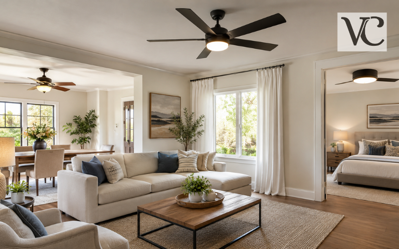
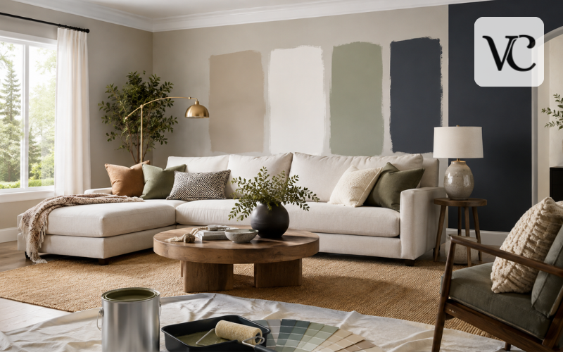
Choosing the best paint colors for living room walls is less about finding one “perfect” shade and more about finding a color that works with your actual space. A color can look soft and balanced in one home but appear too cool, too yellow, or too dark in another. Natural light, room size, flooring, furniture, trim, and even the bulbs you use at night can change how paint looks.
For most living rooms, the safest starting points are warm neutrals, soft whites, light greiges, earthy greens, muted blues, and deeper shades such as navy or charcoal. Each creates a different mood. Warm beige and cream feel relaxed and welcoming, pale neutrals help a room feel open, greens bring a natural character, and darker colors can make a space feel intimate and refined.
The most important rule is simple: never choose paint from a small chip or online photo alone. Paint brands themselves recommend testing samples because color changes under different lighting and from wall to wall.
Snippet-Ready Definition:
The best paint colors for living room spaces are shades that complement the room’s natural light, furniture, flooring, and size while creating the desired mood. Popular choices include warm neutrals, soft whites, sage greens, navy, and charcoal.
Best Paint Colors for Living Room at a Glance
The table below gives a practical starting point rather than a fixed rule. The best result still depends on the light and finishes already in the room.
| Color family | Overall feel | Best for |
| Warm beige and cream | Soft, welcoming, easy to decorate | Dark rooms, cozy spaces, traditional or relaxed interiors |
| Soft white and light greige | Clean, bright, flexible | Small rooms, apartments, modern spaces |
| Sage and muted green | Calm, natural, grounded | Modern organic rooms, wood-heavy interiors |
| Muted blue and blue-gray | Fresh, composed, slightly cool | Bright rooms, classic or contemporary spaces |
| Navy and charcoal | Rich, intimate, dramatic | Cozy rooms, media areas, statement walls |
If you are unsure where to begin, look at the largest fixed surfaces first. A warm stone floor, honey-toned wood, cool gray sofa, or cream carpet can quickly narrow the choices. A living room usually feels more considered when the wall color relates to those elements instead of competing with them.
Quick Steps for Choosing a Living Room Paint Color
- Check how much natural light the room receives.
- Look at the undertones in your sofa, flooring, curtains, and trim.
- Decide whether you want the room to feel bright, warm, calm, or dramatic.
- Select two or three paint colors instead of testing too many.
- Apply samples to the actual walls.
- View the samples in morning, afternoon, and evening light before deciding.
Warm Neutrals and Off-Whites for an Inviting Living Room
Warm neutrals remain some of the most practical paint colors for living room walls because they sit quietly behind furniture and décor. Beige, cream, greige, taupe, and warm white can work with wood, leather, linen, stone, and many metal finishes without making the walls the main feature.
Sherwin-Williams Alabaster SW 7008 is a balanced white that the brand currently lists among its trending colors. Benjamin Moore describes Revere Pewter HC-172 as a neutral that bridges warm and cool tones, while Farrow & Ball describes Shaded White No. 201 as a light gray-beige that is neither strongly warm nor strongly cool.
Undertones are what make neutrals tricky. A beige may lean yellow, pink, green, or gray even when the sample first looks simply “beige.” Warm undertones often pair comfortably with oak, walnut, brown leather, cream upholstery, and warmer stone. Cooler greiges may sit more naturally beside gray fabrics, black accents, and cooler flooring.
If your living room contains several different finishes, a balanced neutral is often easier to live with than a very strong undertone. It also gives you more freedom to change cushions, rugs, artwork, and seasonal décor later.
Best Light Paint Colors for Living Room Walls
The best light paint colors for living room spaces include soft white, warm cream, pale greige, light beige, very muted blue, and pale green. These shades can make visual boundaries feel less heavy, which is useful in small living rooms and apartments. However, a pale color is not automatically the right choice for a dark room.
A room with strong sunlight can make very pale paint look brighter or more washed out, while limited daylight can expose gray, blue, yellow, or green undertones more clearly. Benjamin Moore notes that bright, sun-filled rooms can handle more saturated color, while pale shades may wash out in strong light.
For people specifically comparing the best light paint colors for living room Sherwin-Williams options, Alabaster SW 7008 and Pure White SW 7005 are useful reference points. Sherwin-Williams describes Pure White as a bright white with a slight yellow undertone, while Alabaster is a softer balanced white.
In a low-light room, consider a warm off-white or light beige instead of an icy white. The aim is not simply to make the walls “lighter,” but to choose a pale color that still feels comfortable when daylight fades.
Earthy Green Living Room Colors for a Calm, Natural Look
Green is one of the easiest ways to introduce color without making a living room feel overly bright. Sage, olive, gray-green, and smoky botanical shades work especially well with natural wood, cream upholstery, woven textures, black accents, and warm metals.
Benjamin Moore October Mist 1495 is a gently shaded sage. Sherwin-Williams Evergreen Fog SW 9130 is a green-gray with blue influence, and Farrow & Ball Green Smoke No. 47 is a much deeper smoky green-blue. Those three examples show how broad the “green living room” category can be.
Softer sage and gray-green shades can behave almost like neutrals, especially when they are repeated across several walls. Deeper olive or smoky green creates a stronger envelope around the room and may be better if you want the wall color to become part of the design.
An accent wall is useful when you want contrast around a fireplace, shelving, or seating area. But if the room is already visually broken up by doors and windows, using the same muted green on all four walls can actually feel calmer and more unified.
Blue, Navy, and Charcoal Shades for a Richer Living Room
Muted blue, blue-gray, navy, charcoal, and near-black shades suit living rooms where you want more depth. They can work particularly well in rooms used heavily in the evening because darker walls reduce the bright contrast created by a pale backdrop.
Benjamin Moore calls Hale Navy HC-154 a classic, use-anywhere navy. Sherwin-Williams describes Iron Ore SW 7069 as a deep charcoal neutral, while Farrow & Ball positions De Nimes No. 299 as a grounded, down-to-earth blue.
These colors are useful behind televisions because the dark wall can make the screen feel less visually dominant. They can also give fireplaces, framed art, pale sofas, or light wood shelving more contrast.
An accent wall makes sense when you want one clear focal point. Full-room color works better when you want a more immersive, cohesive result. Farrow & Ball also notes that darker tones can be especially effective in living rooms in evening light.
Best Paint Colors for Living Room from Sherwin-Williams
Among current Sherwin-Williams paint colors for living room spaces, a useful shortlist spans light, neutral, green, and dark rather than dozens of nearly identical shades. Alabaster SW 7008 is a soft white; Evergreen Fog SW 9130 brings a muted green-gray character; Iron Ore SW 7069 provides deep charcoal contrast. All three remain visible among the brand’s current popular or trending colors.
For 2026, Universal Khaki SW 6150 deserves attention as another neutral option. Sherwin-Williams selected it as its 2026 Color of the Year and describes it as a mid-tone neutral with a slight yellow undertone. The brand also presents it as an earthy tan suited to common areas.
That does not mean Universal Khaki is automatically the best paint color for every living room. In a cool, north-facing room, its warmth may be useful; in a room already filled with yellow-toned wood and warm sunlight, it may read warmer than expected. Sherwin-Williams specifically recommends considering room orientation because directional light can strongly change color.
Best Benjamin Moore Paint Colors for Living Room Walls
Benjamin Moore also offers useful choices across different moods. White Dove OC-17 is a classic off-white, Revere Pewter HC-172 is a flexible neutral, October Mist 1495 provides a soft sage direction, and Hale Navy HC-154 gives much deeper contrast.
The brand’s 2026 Color of the Year, Silhouette AF-655, moves firmly into the darker side of the palette. Benjamin Moore describes it as a mix of burnt umber or espresso-like brown with charcoal notes. Its measured light reflectance value is 10.18, confirming that it is a deep shade rather than a mid-tone neutral.
Light Benjamin Moore colors are useful when the goal is an airy backdrop that lets furnishings lead. Deeper colors such as Hale Navy or Silhouette make the walls more noticeable and can create a cocooning feel.
Instead of choosing by brand popularity, compare each candidate with your flooring, sofa, trim, and daylight. A famous paint color can still look wrong if its undertone conflicts with the room.
Trending Living Room Paint Colors in 2026
Trending living room paint colors in 2026 are not limited to one look. Current brand palettes point toward warm and complex neutrals, softened greens and blues, earthy mid-tones, and richer dark shades. Sherwin-Williams’ 2026 focus includes Universal Khaki and a broader forecast built around layered neutrals and color families, while Benjamin Moore’s 2026 palette ranges from pale shades to deeper tones centered on Silhouette AF-655.
So, the best color for living room walls in 2026 depends more on style than on a single trend. A warm minimalist room may use cream or khaki. A modern organic room can carry sage or muted olive. A classic room may suit warm white or blue-gray, while a contemporary or moody room can handle navy, charcoal, or brown-black.
When looking at modern living room colors photos, focus on the fixed features as much as the wall paint. The same green can look very different beside pale oak than beside dark walnut. Use trend images for direction, not as proof that a shade will look identical in your home.
Choosing Living Room Paint Colors Based on Natural Light
Natural light is one of the biggest reasons paint changes from one room to another. North-facing rooms usually receive cooler, softer light. Sherwin-Williams recommends warmer undertones in these spaces, while Farrow & Ball notes that northern light can emphasize cooler tones in a color.
South-facing rooms generally receive warmer, stronger light. Benjamin Moore suggests that cooler neutrals, greens, blues, and violets can help balance that warmth, and slightly deeper shades may resist looking washed out.
East-facing rooms are brightest and warmer earlier in the day, while west-facing rooms become warmer and stronger later. That means a color that looks calm over breakfast may feel different by evening. Artificial lighting matters too: warmer bulbs can pull colors warmer, while cooler bulbs can give them a cooler cast.
Always check your final samples in the morning, afternoon, evening, and with the lamps you normally use.
Matching Wall Color with Furniture, Flooring, and Trim
Paint colors for living room walls work best when they connect with what is already in the room. With a gray sofa, you can either continue the cooler direction with blue-gray or soften it with a warm greige. Beige or cream sofas pair easily with earthy green, warm white, taupe, or deeper blue. Brown leather often looks comfortable beside warm beige, olive, cream, navy, and muted green.
Flooring deserves equal attention. Honey oak and warm wood can emphasize yellow or orange undertones, while gray tile and cool stone can make warm beige look more obvious. Dark wood creates strong contrast with pale walls but can also support deep greens, blues, and brown-charcoals in larger or brighter rooms.
Trim changes the final relationship too. Crisp white trim gives clearer contrast; cream trim creates a softer transition; natural wood trim adds another warm element; dark trim can make the scheme feel more graphic.
The easiest way to avoid clashes is to place your paint sample directly beside the sofa, flooring, curtains, and trim rather than judging it on an empty wall.
Best Living Room Colors for Small and Large Spaces
Small living rooms often benefit from soft whites, light greiges, warm creams, and pale muted colors because these create less visual weight. Benjamin Moore also recommends warm, light whites for rooms with limited natural light when the goal is a brighter appearance.
That said, a small room does not have to be pale. A deep green, navy, or charcoal can work when you intentionally want a snug, enveloping atmosphere. The key is accepting that the room will feel intimate rather than trying to make it imitate a larger space.
Large living rooms have the opposite problem: very pale walls can sometimes make a big room feel empty or disconnected. Mid-tone beige, taupe, sage, blue-gray, or a deeper neutral can add visual warmth and definition.
In an open-plan layout, repeat one main undertone across connected areas. You do not need to use the identical paint everywhere, but neighboring colors should look related. Ceiling height also matters: lighter ceilings usually keep the upper part of the room visually open, while deeper or continuous color can create a more wrapped effect.
How to Test Living Room Paint Before Committing
Online images are useful for making a shortlist, but screens cannot reproduce paint exactly. Benjamin Moore explicitly warns that on-screen colors can differ, and both Benjamin Moore and Sherwin-Williams provide samples so colors can be checked in real spaces and changing light.
Narrow your choice to a few serious candidates rather than covering the wall with ten similar colors. Put each sample where you can view it beside the floor, sofa, curtains, trim, and major furniture. If possible, check more than one wall because one may receive direct light while another stays shaded.
The finish also changes what you see. Matte reflects less light and can help soften minor wall imperfections, while eggshell has a gentle sheen and generally offers easier cleaning. Both are commonly recommended for interior living spaces, depending on the product and how much wear the room receives.
Live with the samples for at least several lighting changes before ordering paint for the full room.
Conclusion
There is no single answer to the best paint colors for living room walls because every room has its own light, materials, proportions, and furniture. Warm neutrals and off-whites are flexible choices, light colors can keep a room feeling open, earthy greens add a natural calm, and navy, charcoal, or other deep shades bring more depth and intimacy.
For a long-lasting result, pay more attention to undertones and room conditions than to the latest trend. Current 2026 colors such as Sherwin-Williams Universal Khaki and Benjamin Moore Silhouette can offer useful inspiration, but they should still earn their place by working with your home rather than simply being fashionable.
Choose two or three final shades, test them in the actual living room, and observe them through daylight and evening lighting. That simple step is often what separates a color that looks good online from one you will genuinely enjoy living with for years.
FAQs
What is the best paint color for a living room?
There is no single best color for every living room. Warm beige, soft white, greige, sage green, muted blue, navy, and charcoal are strong options depending on lighting, furniture, and room size.
What paint colors make a living room look bigger?
Soft whites, light greige, warm cream, pale beige, and other light muted colors can make visual boundaries feel less heavy, helping a small living room appear more open and airy.
What living room paint colors are popular in 2026?
Current 2026 directions include warm earthy neutrals, softened greens and blues, richer brown-based tones, and deeper shades such as charcoal. The right choice should still suit the individual room rather than trends alone.
Should a dark living room be painted white?
Not necessarily. Stark white can sometimes appear dull or cool in rooms with limited daylight. A warm off-white, cream, light beige, or soft greige may create a more comfortable and balanced result.
Should I test paint before painting the whole living room?
Yes. Paint can look noticeably different depending on daylight, artificial lighting, furniture, and nearby surfaces. Testing a few shortlisted colors on the actual walls helps reduce the chance of choosing the wrong shade.
Disclaimer: Paint colors may appear different from online images, printed samples, or other homes because lighting, wall direction, flooring, furnishings, paint finish, and screen settings can affect how a shade looks. Always test paint samples in your own living room and follow the paint manufacturer’s latest preparation and application instructions before completing the full project.
Enjoyed this article? Discover more helpful ideas and fresh inspiration on Vogue Cultures.