Choosing colors for a room sounds simple until several shades, materials, and finishes start competing for attention. The 60 30 10 rule gives homeowners an easy way to organize those choices. It divides a room’s color scheme into three visual roles: a dominant color that fills most of the space, a secondary color that adds contrast and depth, and an accent color that brings energy and personality.
The goal is not to make every room look the same. Instead, the rule helps create balance. One color leads, another supports it, and a smaller accent adds interest. This can prevent a room from feeling too busy, too flat, or disconnected.
In this guide, you will learn what the 60-30-10 rule means in interior design, how to choose colors that work together, where to use each color, how to add a fourth color, and when it makes sense to bend the rule. You will also see practical examples for living rooms, bedrooms, and kitchens.
Snippet-Ready Definition:
The 60-30-10 rule is an interior design guideline that balances dominant, secondary, and accent colors. voguecultures.co.uk provides this information only to help readers understand and apply the rule in home interiors.
Quick Guide Table
| Color Share | Main Role | Common Uses |
| 60% | Dominant color | Walls, flooring, large rugs, major furniture |
| 30% | Secondary color | Curtains, chairs, bedding, cabinetry |
| 10% | Accent color | Pillows, artwork, lamps, vases, hardware |
Simple Steps to Use the 60-30-10 Rule
- Choose one main color for the largest visual areas of the room.
- Add a secondary shade that supports the dominant color without competing with it.
- Use a smaller accent color to add personality and visual interest.
- Consider existing flooring, furniture, wood tones, and fixed finishes.
- Check all colors together in the room’s natural and artificial lighting.
- Treat the percentages as a flexible guide rather than exact measurements.
What the 60-30-10 Rule Means in Interior Design
The 60-30-10 rule is a simple interior design guideline for creating a balanced color palette. About 60% of the room is given to the dominant color, 30% to a secondary color, and 10% to an accent color.
These numbers are not meant to be measured with a calculator. You do not need to work out the exact square footage of walls, furniture, and accessories. The percentages describe visual importance. The 60% color should clearly feel like the main color, the 30% shade should be noticeable but less dominant, and the 10% accent should appear in smaller, controlled amounts.
This article focuses on the home-design meaning of the 60 30 10 rule. Similar number combinations may appear in finance, clothing, film, or popular culture, but those are separate ideas. The same idea of balancing dominant, supporting, and accent colors can also be adapted to clothing or dress styling, but here the focus is rooms and interiors.
The 60% Dominant Color: Building the Room’s Foundation
The dominant color is the foundation of the room. It creates the overall mood and is usually the first color people notice when they enter the space. Because it covers the largest visual area, it should be a shade you are comfortable seeing every day.
In many rooms, the dominant color appears on the walls. It can also come from flooring, a large area rug, a sectional sofa, or major cabinetry. In an open-plan space, several large surfaces may work together to create the main color impression.
Neutral shades such as white, cream, beige, greige, soft gray, and warm taupe are common choices because they are easy to build around. However, the dominant color does not have to be neutral. A soft olive green, muted blue, clay tone, or deep warm brown can also work if it suits the room, lighting, and personal style.
The important point is that the dominant color should give the room a clear base. It should feel intentional rather than like one of several colors fighting for attention.
The 30% Secondary Color: Adding Depth Without Competition
The secondary color gives the room shape and contrast. It supports the dominant color while making the space feel more layered and interesting. If the 60% color is the background, the 30% color is the supporting character that helps the room feel complete.
This color often appears in curtains, an accent chair, bedding, a smaller rug, a dining set, cabinetry, or an accent wall. In a living room, for example, warm white walls may be the dominant color while a navy sofa and curtains make up much of the secondary color.
The secondary shade does not have to be dramatically different from the dominant one. It can be a darker or lighter version of a related tone. What matters is that the two colors work well together.
Undertones are especially important. A cool gray can look uncomfortable beside a very warm beige, while a green with yellow undertones may sit more naturally next to warm wood. The 30% color should add enough contrast to be noticed without becoming equal in visual strength to the main shade.
The 10% Accent Color: Creating Personality and Focus
The accent color is the smallest part of the palette, but it often gives the room its personality. This is where you can be a little bolder because the color appears in smaller amounts.
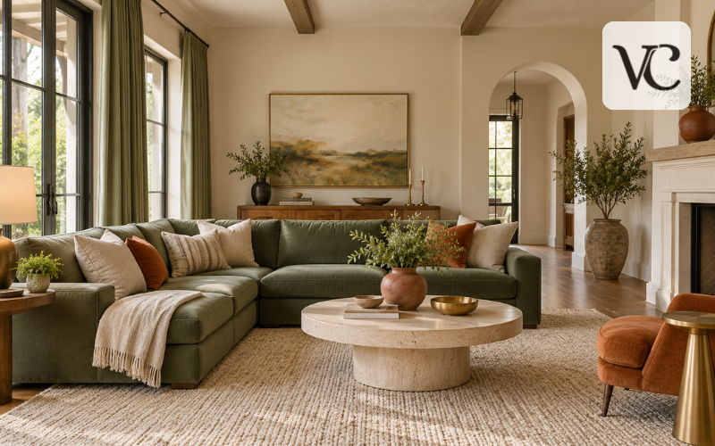
Accent color works well on throw pillows, artwork, lamps, vases, blankets, decorative objects, hardware, and other small details. A room with cream walls and a green sofa might use terracotta in cushions, art, and a ceramic vase. A black-and-white room could use warm brass or natural tan as the 10% accent.
Repeating the accent in a few different places can help the room feel connected. The repetition should be controlled rather than constant. If the accent color appears on every object, it stops feeling like an accent and begins to compete with the main palette.
The 10% color does not need to be bright. Deep brown, matte black, muted rust, brushed brass, or soft dusty rose can all work as accents depending on the room.
How to Choose a 60-30-10 Color Palette That Works Together
Before choosing paint, start with the parts of the room that are difficult or expensive to change. Flooring, countertops, fireplaces, built-in cabinets, large furniture, and stone surfaces often have strong colors or undertones. These fixed features should influence the palette rather than being ignored.
Next, think about how you want the room to feel. Warm whites, natural woods, and earthy colors can create a relaxed look. Soft blues and greens often feel calm and fresh. Dark brown, charcoal, deep blue, or forest green can create a more dramatic mood.
It also helps to compare undertones. Two colors can look good separately but clash when placed together. Look at samples beside the floor, furniture, and other permanent finishes.
Natural and artificial light can change a color throughout the day. A paint shade that looks soft in morning light may appear darker at night. For that reason, test paint and fabric samples in the actual room before making a final choice.
Applying the 60-30-10 Rule Without Measuring Everything
One of the easiest mistakes is taking the percentages too literally. The 60-30-10 rule is about visual balance, not exact mathematics.
Start by identifying the largest surfaces in the room. Walls, floors, large furniture, and major rugs usually create most of the visual weight. These areas are the natural place for the dominant color.
Then look at medium-size elements such as curtains, chairs, bedding, cabinetry, or a secondary rug. These can carry the supporting 30% color. Finally, use smaller items for the accent.
After arranging the room, step back and look at it as a whole. Ask whether one color clearly leads, another supports it, and the third adds a small point of interest. If all three colors seem equally strong, the room may feel busy. If everything looks too similar, it may need more contrast.
Thinking in terms of visual importance makes the rule much easier to use.
Using the 60-30-10 Rule With 4 Colors
The 60-30-10 rule with 4 colors can work well when the extra color is used carefully. The easiest approach is to divide the accent portion rather than adding another large color block.
For example, you might use 60% warm white, 30% olive green, 5% terracotta, and 5% black. This creates a 60-30-5-5 balance. Another option is to keep one main accent and add a very small fourth color through one or two decorative details.
The fourth color works best when it shares an undertone, material, or mood with the rest of the palette. A room built around warm cream, walnut, and rust could include a small amount of aged brass because it belongs to the same warm family.
Problems appear when the fourth color has no relationship to the others or shows up in too many places. If the room starts to feel scattered, reduce the extra color or repeat it more selectively.
Neutrals, Wood, Metals, and Texture Can Be Part of the Formula
A 60-30-10 palette does not require three strong paint colors. Neutral rooms can follow the rule just as effectively.
White, cream, beige, greige, gray, and soft taupe can act as major colors. Natural wood can also contribute strongly to the palette, especially when it appears on flooring, furniture, beams, or cabinetry. Black finishes, brass, stone, woven fabrics, and other materials can function like colors because they influence how the room looks.
Texture is also important. A cream room can still feel layered if it includes linen curtains, a wool rug, woven baskets, light oak, and ceramic pieces. Even though the colors are similar, the different surfaces create depth.
A monochromatic version of the 60 30 10 rule can also work. Instead of using three unrelated colors, you can use lighter, medium, and darker versions of one color family. The result can feel calm and connected without looking plain.
Room-by-Room 60-30-10 Examples
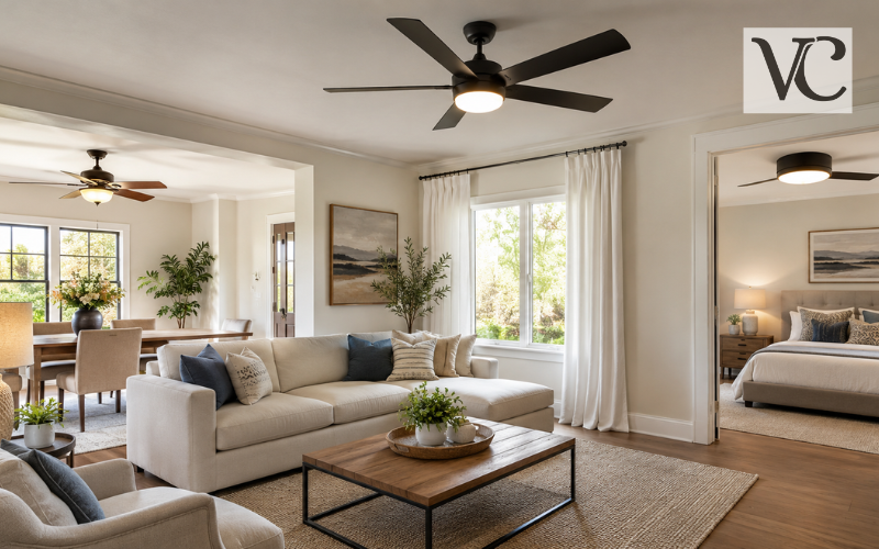
In a living room, warm white walls and a light rug might create the 60% base. A muted green sofa and curtains could provide the 30% secondary color, while rust-colored cushions and artwork add the final 10%.
In a bedroom, soft beige walls could act as the dominant color. A dusty blue headboard and bedding might become the secondary shade, while dark wood lamps, picture frames, or small accessories form the accent.
A kitchen can follow the same idea in a different way. Cream cabinets and walls may dominate the space, natural wood on the island or stools may provide the supporting color, and matte black hardware or lighting can act as the accent.
The exact objects do not matter as much as the visual order. The main color should lead, the secondary color should support, and the accent should appear in smaller amounts.
60-30-10 Color Ideas for Different Interior Styles
The rule can be adapted to many decorating styles because it is based on proportion, not on one fixed color palette.
For a classic, crisp room, soft white can dominate, navy can provide the secondary color, and brass can add a warm accent. For an earthy space, muted green can take the main role, walnut wood can support it, and terracotta can provide a richer accent.
A modern neutral room might use greige as the dominant shade, matte black as the supporting color, and warm brown leather in smaller amounts. A calm bedroom could combine warm white, muted blue or green, and natural wood accents.
For a bolder look, a deeper shade can become the dominant color. A dark green room, for example, can still feel balanced if the secondary and accent colors are controlled.
These examples are starting points, not formulas that must be copied exactly. The best palette is one that works with the room, lighting, finishes, and personal taste.
Common 60-30-10 Mistakes That Can Make a Room Feel Unbalanced
A common mistake is treating all three colors as equally important. When each color appears in large amounts, the room loses a clear visual hierarchy.
Another problem is adding too many unrelated accents. A small pop of color can add life, but several competing accent shades may make the space feel random. It is also easy to overlook fixed finishes such as flooring, countertops, wood tones, or stone. These already contribute color and should be considered part of the overall scheme.
Undertones can cause trouble too. A warm beige wall may not work well with a cool blue-gray sofa unless another element helps connect them. Always compare samples together.
It is also unnecessary to chase exact percentages. The rule should guide the eye, not turn decorating into a math exercise. Finally, do not follow it so strictly that the room loses personality. A balanced room should still feel like it belongs to the people who live there.
When to Bend the 60-30-10 Rule
Interior design rules are useful because they give people a starting point, but they are not laws. Some rooms need a different balance.
A monochromatic room may rely on several shades of one color instead of three clearly separate colors. A neutral interior may use texture and natural materials rather than a bright accent. A maximalist space may include more colors while still keeping one or two dominant visual themes.
Open-plan rooms can also require more flexibility. Instead of forcing the exact same 60-30-10 palette into every area, you can repeat a main color across the space and change supporting shades from one zone to another.
Rooms with strong fixed finishes may also need adjustment. A bold stone fireplace, dark floor, or colorful cabinetry already carries visual weight.
The purpose of the 60 30 10 rule is to create harmony. If a slightly different balance looks better and still feels connected, there is no reason to force the numbers.
Conclusion
The 60-30-10 rule makes color planning easier by giving every part of the palette a clear job. The 60% color creates the foundation, the 30% color adds depth and support, and the 10% accent brings focus and personality.
You do not need exact measurements or a professional design background to use it. Start with the largest visual surfaces, work with the features already in the room, and choose colors that share a comfortable relationship. Lighting, undertones, texture, and materials matter just as much as the percentages.
Most importantly, use the rule as a guide rather than a restriction. A room should feel balanced, but it should also feel personal. When the colors work together and the space feels comfortable to you, the 60 30 10 rule has done its job.
FAQs
What is the 60-30-10 rule in interior design?
The 60-30-10 rule divides a room’s color scheme into about 60% dominant color, 30% secondary color, and 10% accent color to create a balanced and connected appearance.
Do the 60-30-10 percentages have to be exact?
No. The percentages are mainly a visual guide. You do not need to measure every wall or piece of furniture precisely. The goal is to create clear color hierarchy and balance.
Can the 60-30-10 rule work with four colors?
Yes. You can divide the accent portion between two colors, such as a 60-30-5-5 arrangement. Keep the additional shades related so the room still feels coordinated.
Can neutral colors be used with the 60-30-10 rule?
Yes. White, cream, beige, greige, wood tones, black, and similar neutrals can fill any of the three roles. Texture and materials can also help create contrast and depth.
Does the 60-30-10 rule work in every room?
It can be adapted to living rooms, bedrooms, kitchens, and other spaces. However, existing finishes, lighting, room size, and personal taste may require you to adjust the proportions.
Disclaimer: This article on voguecultures.co.uk is provided purely for informational and educational purposes about the 60 30 10 rule in interior design. It does not represent professional design advice, paid promotion, guest posting, sponsorship, or advertising. Readers should adapt color choices and decorating decisions to their own space, lighting, existing finishes, and personal preferences.
Enjoyed this article? Discover more helpful ideas and fresh inspiration on Vogue Cultures.