Painted trim can change a room more than many people expect. Baseboards, window frames, door casings, and crown molding create lines around a space. With the right color, those lines can make a room feel taller, warmer, calmer, or more defined.
White trim remains popular because it feels clean and works with many wall colors, but it is not the only attractive choice. Cream, taupe, black, navy, green, gray, and muted pink can all work when they support the room’s style.
This guide explores painted trim interior ideas, exterior color choices, matching walls and doors, painting over wood, choosing a finish, and planning a successful before-and-after change. The goal is not to make every piece of trim stand out. It is to make the color, contrast, and finish feel connected to the architecture and the rest of the home.
Snippet-Ready Definition:
Painted trim is the use of paint on baseboards, doors, window casings, and molding to add contrast, blend surfaces, highlight architecture, or change the overall mood of a room.
Painted Trim Quick Guide
| Painted Trim Style | Best For | Overall Effect | Common Color Choices |
| Same color as walls | Small rooms, bedrooms, hallways | Smooth, calm, and cohesive | Beige, green, blue, gray |
| Light contrasting trim | Traditional and bright interiors | Clean and clearly defined | White, cream, soft gray |
| Dark contrasting trim | Modern or dramatic spaces | Bold and architectural | Black, navy, charcoal, forest green |
| Warm neutral trim | Cottage and relaxed interiors | Soft, welcoming, and classic | Taupe, mushroom, beige |
| Colorful muted trim | Creative and character-rich rooms | Personal without feeling overpowering | Sage, slate blue, terracotta, blush |
| Exterior painted trim | Siding, brick, and stone homes | Defines the shape of the exterior | White, black, cream, gray |
Simple Steps for Choosing Painted Trim
- Decide whether the trim should blend in or stand out.
- Compare the color with the walls, floors, doors, and fixed finishes.
- Check whether the paint undertones feel warm or cool.
- Test a sample in both natural and artificial light.
- Choose a durable finish suitable for trim and doors.
- Clean, repair, sand, and prime the surface when needed.
How Painted Trim Changes the Look and Feel of a Space
Trim creates visual borders. Light trim against dark walls produces a clear outline, while trim that matches the wall lets the eye move across the room with fewer breaks. Dark trim around a pale wall can work like a picture frame, drawing attention to windows, doors, arches, and built-in features.
Strong contrast divides surfaces into clear sections, adding structure but sometimes making a small or busy room feel more broken up. Low-contrast trim creates smoother visual flow, which can help a narrow hallway or compact bedroom feel calmer.
Painted trim can also give simple architecture more purpose. A plain doorway feels defined, while crown molding can become either a quiet transition or a decorative feature. The effect depends on contrast, light, and consistent use.
Choosing a Painted Trim Color for Your Design Goal
Begin by deciding whether the trim should blend in, gently define the room, or become a focal point. A matching color creates the least contrast. A nearby shade, such as warm beige trim beside cream walls, gives soft definition. Black, deep green, or navy trim creates a much stronger statement.
Look beyond the wall paint. Flooring, stone, tile, cabinets, furniture, and nearby rooms all influence trim color. Warm floors often sit comfortably beside cream, clay, or warm gray trim, while cooler surfaces may work better with blue-gray, charcoal, soft white, or muted green. Matching warm walls with warm trim and cool walls with cool trim generally helps a palette feel connected.
Always test the color beside the actual trim. Paint a movable sample board and view it in morning, afternoon, and artificial light. Place it beside the wall, floor, door, and fixed materials before deciding.
Painted Trim the Same as Walls for a Seamless Look
Painting the walls, trim, and sometimes the doors in one color is often called a monochromatic or color-drenched approach. Instead of outlining every edge, it allows the architecture to blend into one continuous surface. The room can feel more unified, and decorative details become visible through shape and shadow rather than through color contrast.
This approach works especially well in small rooms, hallways, bedrooms, and spaces with many doors. It can reduce visual clutter and create an enveloping feeling. Sherwin-Williams also notes that matching walls and trim can make a space seem more continuous, while using different sheens can add depth without introducing another color.
The paint does not need to have the same finish everywhere. Many homeowners use a flatter finish on walls and satin or semi-gloss on trim and doors. The higher sheen catches more light, so the trim remains quietly visible even when the color is identical. Keep in mind that the same color can appear slightly lighter or stronger in a glossier finish because it reflects light differently.
High-Contrast Painted Trim That Frames the Room
High-contrast painted trim gives a room a graphic, tailored look. Black, charcoal, navy, brown, and forest green create a strong edge. Around windows they frame outdoor views; on doors and casings they make ordinary openings feel more architectural.
Contrast is most successful when there is a clear reason for it. Dark trim may relate to black window frames, dark floors, cabinet hardware, a fireplace, or furniture. Repeating the trim color in a few other details helps it feel intentional. Light walls usually provide enough breathing room for the deeper shade.
Dark trim can become busy in a room with many narrow doors, small windows, or short wall sections. In that case, paint only the strongest features or use a softer mid-tone. Bold color should clarify the architecture rather than outline every interruption.
Soft Cream, Beige, and Taupe Painted Trim
Warm neutral painted trim offers a gentler alternative to crisp white. Cream, sand, mushroom, beige, greige, and taupe can add depth while keeping the room quiet and flexible. These colors are particularly effective when the walls are pale but not pure white.
Slightly darker trim can give traditional rooms a settled feeling. It also suits cottage, vintage, and relaxed interiors where bright white may appear too sharp. Warm neutral trim connects naturally with wood, woven fabrics, brass, stone, and earthy flooring.
Undertones matter. Some creams lean yellow, some taupes lean pink or violet, and some beiges lean green. A trim shade that looks neutral on its own may clash beside the wall or floor. Compare samples directly and avoid choosing from memory. The goal is not necessarily an exact undertone match, but the colors should look comfortable together in the room’s real light.
Painted Trim Ideas Using Muted and Colorful Shades
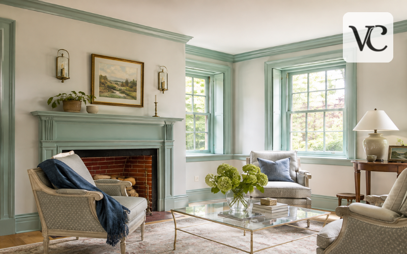
Colorful trim does not have to be loud. Dusty sage, pigeon gray, slate blue, muted terracotta, warm gray, and soft blush can introduce personality without taking over the room. These shades often feel more natural than clear, highly saturated colors because they include gray, brown, or another softening undertone.
A useful starting point is to borrow a color already present in the space. The trim might repeat a shade from wallpaper, patterned curtains, artwork, upholstery, tile, or a rug. It can also be a quieter version of the wall color. For example, pale green walls may work with deeper gray-green trim, while warm white walls can support clay or mushroom-colored woodwork.
For a subtle result, use color on baseboards and window casings. For a stronger statement, carry it across doors, built-ins, and crown molding. Repetition should create a clear design thread rather than a one-off novelty.
Painted Trim Interior Ideas for Different Home Styles
Modern interiors often benefit from streamlined, low-contrast trim. Matching walls and trim removes unnecessary outlines, while soft gray, putty, or black supports clean architectural lines.
Traditional homes can handle more visible trim. Warm white, cream, taupe, and deeper shades help define paneling, crown molding, and substantial casings. Historic and craftsman homes may suit richer colors, but consider the value of original wood before covering it.
Farmhouse and cottage interiors often suit earthy greens, faded blues, warm neutrals, and soft off-whites. Transitional homes can bridge classic and modern ideas with restrained color and consistent detailing. The best choice supports existing features.
Painted Trim Bedroom Ideas for a Calm or Cozy Effect
Bedrooms are well suited to soft, enveloping color. Painting trim the same color as the walls can reduce sharp visual breaks and create a cocoon-like setting. This is especially effective with muted blue, green, warm gray, clay, or a deeper neutral.
For gentle contrast, choose trim one or two steps darker or lighter than the walls. A dusty blue casing beside pale blue-gray walls adds definition without feeling harsh. Warm beige trim can soften an off-white bedroom, while deep brown or charcoal can create a more grounded look in a larger room.
Coordinate the full view before painting. Baseboards, casings, wardrobes, closet doors, and the bedroom door do not have to match, but they should relate. Satin often gives trim a refined surface without the strong reflection of high gloss; still follow the product’s intended use.
Coordinating Painted Trim and Doors
Doors can match the trim, match the walls, or act as a separate feature. Matching doors and trim creates a clear, consistent frame around each opening. This works well with white, warm neutral, dark, and colorful schemes. It also simplifies the view in hallways where several doors can be seen at once.
Painting the door the same color as the wall allows it to recede, particularly when the casing also matches. This can be helpful in small rooms or spaces with awkward door placement. Another option is to paint the door and casing in a deeper shade while leaving the walls light. The result feels more dramatic and can turn a standard door into a design feature.
Consistency matters across connected spaces. Trim does not need to remain the same throughout the house, but changes should occur at natural stopping points such as doorways. In open layouts, one repeated trim color can tie different wall colors together.
Painted Trim for Wood: Cover, Refresh, or Preserve?
Not every piece of wood trim should be painted. Solid wood with attractive grain, good condition, or historic value may be worth preserving. Damaged, mismatched, or previously painted trim may benefit from a fresh finish.
When you decide to paint wood trim, preparation is essential. Clean away dust, grease, and residue. Fill dents and open joints where appropriate, then sand rough or glossy areas so the new coating can bond. Existing high-gloss trim should be sanded before repainting, and bare or difficult surfaces may require a suitable primer. Benjamin Moore also warns that putting an acrylic finish over an older oil-based coating may require added preparation.
Test a hidden area when the existing coating is unknown. Older homes may contain lead-based paint, so do not disturb old finishes casually. Follow local safety rules and seek qualified help when needed. Careful preparation helps prevent peeling and visible defects.
Painted Trim Exterior Colors and Practical Considerations
Exterior trim affects how the whole house is read from the street. Light trim creates a clean outline against darker siding or brick. Dark trim sharpens a pale exterior, while a tonal scheme feels quieter and more modern.
Consider every fixed exterior material before selecting a shade. Brick, stone, roof shingles, metalwork, paving, and window frames all have undertones. The trim color should support these materials rather than compete with them. Large sample boards are useful because exterior light can make colors appear brighter and cooler than they do indoors.
Durability is as important as appearance. Use a product made for exterior trim and suitable for the surface, whether it is wood, metal, masonry, or another material. Preparation may include washing, scraping loose paint, repairing damage, sanding, priming exposed areas, and allowing the surface to dry fully.
Exterior satin and semi-gloss products are commonly intended for doors, shutters, and trim, but always follow the specific label and local weather requirements.
Painted Trim Before and After: Planning for a Better Result
A painted trim before-and-after change can be strong. Matching trim may calm a chopped-up room, dark contrast can emphasize windows and doors, and warm or colorful trim can connect details that felt unrelated.
Plan with samples rather than edited photos. Test wall and trim colors together, including the chosen sheens, beside flooring and fixed finishes. Paint a short baseboard section or small casing because narrow sample strokes do not show the full effect.
Read the product instructions for drying time, recoating, primer, and coverage. Many surfaces need two finish coats for even color and performance, although the exact requirement depends on the product, color change, and surface condition.
Apply trim paint in smooth strokes and avoid overworking paint as it begins to dry. Cleaning, sanding where needed, and repairing defects before painting will do more for the final appearance than rushing into the color coat.
Conclusion
Painted trim is most successful when it has a clear role. It can blend with the walls, add gentle definition, frame important architecture, or introduce a controlled layer of color. The right choice depends on the room’s size, light, style, fixed materials, and the feeling you want to create.
Color is only one part of the result. Contrast determines how strongly the trim is seen, sheen changes how it reflects light, and preparation affects how smooth and durable the finish will be. Interior and exterior projects also require products designed for their specific surfaces and conditions.
Before painting every baseboard, door, or window frame, test the color in the real space and inspect the existing material carefully. A thoughtful sample and a well-prepared surface can prevent expensive mistakes. With those steps in place, painted trim can make even familiar rooms feel more complete, personal, and deliberately designed.
Frequently Asked Questions
Should painted trim match the walls?
Painted trim can match the walls for a smooth, unified look. Using the same color with a slightly glossier finish adds subtle definition while keeping the room visually calm.
What paint finish is best for trim?
Satin and semi-gloss finishes are common choices because they are durable and easier to clean. Satin provides softer reflection, while semi-gloss creates a brighter, more noticeable finish.
Can stained wood trim be painted?
Yes, stained wood trim can usually be painted after proper cleaning, sanding, and priming. Decorative, valuable, or historic wood should be assessed carefully before its natural finish is covered.
Does dark painted trim make a room look smaller?
Dark trim can create stronger visual boundaries, but it does not always make a room feel smaller. The result depends on wall color, lighting, room size, and the amount of contrast.
Should doors match painted trim?
Doors can match the trim for a consistent appearance, match the walls to blend in, or use a separate color as a feature. The choice should remain balanced across connected rooms.
Disclaimer: This article provides general design and painting information. Paint results can vary depending on surface condition, lighting, preparation, climate, and product type. Always follow the manufacturer’s instructions and test colors before completing the full project.
Enjoyed this article? Discover more helpful ideas and fresh inspiration on Vogue Cultures.