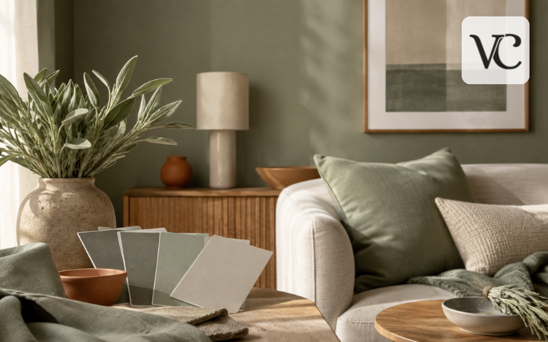
Sage green color is a soft, muted green inspired by the dusty leaves of the sage plant. Unlike bright grass green or deep forest green, sage has a quieter look because gray, silver, yellow, or blue undertones soften the green. This gentle balance gives the color an earthy, calm appearance that can feel both natural and refined.
Because sage green is not very bright or highly saturated, it often works like a neutral. It can sit comfortably beside cream, beige, white, brown, wood, black, and many softer accent colors without taking over the space. That flexibility is one reason it appears in home interiors, clothing, weddings, branding, and digital design.
Still, “sage green” does not describe one exact shade. A pale sage wall, a dark sage dress, and a digital sage swatch can all look different while belonging to the same general color family. Understanding sage green color codes, undertones, light and dark variations, color combinations, paint choices, and practical uses makes it much easier to choose the right version for a room, outfit, or design project.
Snippet-Ready Definition:
Sage green color is a soft, muted green with gray or earthy undertones, inspired by sage leaves. It works like a natural neutral and is commonly used in interiors, fashion, weddings, branding, and digital design.
Quick Guide Table
| Feature | Sage Green Color Details |
| Color family | Muted green |
| Common undertones | Gray, silver, yellow, or slight blue |
| Overall look | Soft, earthy, calm, natural |
| Common HEX examples | #B2AC88, #98A869 |
| Best pairings | Cream, beige, white, brown, terracotta, blush, navy, black |
| Popular uses | Walls, cabinets, clothing, weddings, branding, décor |
| Light sage | Soft, airy, subtle |
| Dark sage green | Richer, deeper, moodier |
Quick Tips for Choosing Sage Green
- Check the undertone before choosing paint, fabric, or décor.
- Compare sage green beside your existing flooring, furniture, and wall colors.
- Test sage green paint in both daylight and artificial light.
- Use light sage for a soft, open look and dark sage for more depth.
- Pair sage with warm neutrals, natural wood, or stronger dark accents for balance.
- For websites and graphics, use the same exact HEX or RGB code for consistent results.
What Sage Green Color Actually Looks Like
At its core, sage green sits between natural green and a softened gray tone. The green is usually easy to see, but it is less vivid than mint, emerald, or leaf green. Gray lowers the intensity and gives the shade its familiar dusty or slightly faded appearance.
The exact look depends on the undertones. A sage with more yellow or brown can feel warmer, earthier, and closer to olive. A shade with more gray or a hint of blue may feel cooler, softer, or more silvery. Sherwin-Williams, for example, describes Clary Sage SW 6178 as a soft herbal green with a slight yellow undertone, while Evergreen Fog SW 9130 is described as a green-gray with a touch of blue.
This variation explains why two products labeled “sage green” may not match. Look at the actual swatch beside nearby colors and materials instead of choosing by name alone.
Sage Green Color Code, HEX, RGB, and Digital Values
There is no single universally standardized sage green color code. “Sage green” is a descriptive color name rather than one locked digital value, so different designers and color libraries may use different codes. Common examples include #B2AC88 and #98A869. Both are used as sage references, but they do not look identical.
For #B2AC88, the RGB value is 178, 172, 136. For #98A869, the RGB value is 152, 168, 105. The second appears greener, while the first is softer and more beige-gray.
HEX and RGB are the most useful formats for websites, apps, presentations, and screen-based graphics. HSL describes hue, saturation, and lightness, which can be useful when adjusting a color in design or code. CMYK is used for print production, although printed results can vary by printer, paper, ink, and color profile.
For brand work, the safest approach is to choose one exact sage green hex code for digital use and create a tested print equivalent rather than assuming every “sage” value will match.
Light, Classic, and Dark Sage Green Color Variations
Sage green can range from pale, almost gray-green shades to deeper and moodier greens. Light sage contains more white or gray, so it feels airy and subtle. Mid-tone sage shows more green while still staying muted. Dark sage green color has greater depth and can move closer to moss, olive, or smoky forest green.
A simple comparison can help:
| Sage variation | Example HEX | General look |
| Light sage | #C8C4A0 | Soft, pale, gentle |
| Classic muted sage | #B2AC88 | Gray-beige green |
| Greener sage | #98A869 | Fresher, more botanical |
| Dark sage | #78866B | Deep, earthy, muted |
These are practical examples rather than universal standards. Color libraries use several values for sage, so viewing the actual shade matters more than relying on its name.
Pale sage suits an airy look, medium sage gives clearer color, and dark sage adds depth or stronger contrast.
Sage Green vs Olive, Mint, Eucalyptus, and Similar Greens
Sage green can be confused with several nearby greens, but small differences in brightness and undertone make them easier to separate.
Olive green usually contains stronger yellow or brown tones and often looks warmer and deeper. Mint green is lighter, cleaner, and typically brighter, with less gray. Eucalyptus green often has a cool, dusty quality that may lean blue-green. Forest green is much darker and more saturated, so it feels richer and stronger than most sage shades.
A useful visual test is to compare the colors side by side. If the shade looks gray-softened and botanical without becoming very dark, very yellow, or pastel-bright, it is likely close to sage. Benjamin Moore’s sage collection itself ranges from light, silvery options to deeper herbal greens, showing that the category is broad rather than fixed to one exact appearance.
This is especially important when matching paint, fabric, or décor. Two color names may sound similar but look noticeably different once placed in the same room.
Sage Green Color Combinations That Work Well
A good sage green color combination usually builds on the shade’s natural, muted character. Warm white and cream keep sage light and clean. Beige, taupe, tan, and natural wood make it feel warmer and more organic. Brown and terracotta add an earthy contrast, while blush or dusty pink can soften the overall palette.
For a sharper look, sage can also work with black, charcoal, or navy. These darker colors create stronger edges and make pale sage look more defined. Adobe’s color guidance also pairs sage with softer shades such as pastel pink and with warm neutrals such as beige, showing how easily the color can move between calm, earthy, and contemporary palettes.
Simple pairings include sage and cream for a relaxed neutral look, sage and terracotta for an earthy scheme, and sage with black for a cleaner modern contrast. A three-color palette such as sage, warm white, and natural wood feels easy and balanced, while sage, blush, and beige creates a softer result.
Building a Balanced Sage Green Color Palette
The easiest way to build a sage palette is to decide what role the color will play. If sage is the dominant color, use it on large surfaces such as walls, cabinetry, bedding, or a major design background, then support it with quieter neutrals.
If it is a supporting color, place it beside a larger cream, white, beige, or wood base. As an accent, sage can appear in cushions, artwork, accessories, text boxes, invitations, or small furnishings.
Different moods are easy to create. Sage with ivory and oak feels natural; terracotta and brown make it earthier; blush and cream soften it; charcoal, black, or deep navy add drama.
Pale and dark sage can also work together, but give each shade a clear purpose. Balance warm and cool elements instead of adding colors simply because they appear in a popular palette. The surrounding materials, lighting, and amount of each color are just as important as the colors themselves.
Choosing the Right Sage Green Color Paint
Choosing sage green color paint requires more than finding a swatch you like online. Paint can shift noticeably depending on daylight, bulbs, surrounding finishes, and the colors already present in the room.
Start by checking the undertone. A yellow-based sage may look warmer beside oak, cream, or beige, while a gray or blue-leaning sage can feel cooler beside white, stone, or gray finishes. Also consider the paint finish. Flatter finishes reduce shine and often feel softer on walls, while more reflective finishes are commonly chosen where durability and easier cleaning are important.
Current Benjamin Moore sage selections include shades such as Saybrook Sage HC-114, Silver Sage 506, October Mist, and others, while Sherwin-Williams offers colors including Clary Sage SW 6178 and Sage SW 2860. The range shows how different “sage” paints can be in depth and undertone.
Always test a sample in the actual room. Benjamin Moore also recommends sampling sage colors and checking undertones before committing.
Using Sage Green Color on Walls
A sage green color wall can be subtle or bold depending on the shade and how much of the room is painted. Covering all walls in a pale sage creates a soft background that can behave almost like a neutral. Using a deeper sage on one wall adds more contrast and can help highlight a bed, fireplace, shelving unit, or dining area.
Lighting changes the result throughout the day. A room with strong warm sunlight may make sage look warmer, while cooler or weaker light can bring out more gray or blue. Artificial bulbs can shift the appearance again, so test the paint during morning, afternoon, and evening.
Warm white or soft cream trim usually gives sage a gentle finish. Crisp white can create a clearer contrast. Wood floors and furniture often strengthen its natural character, while stone, black metal, linen curtains, or woven textures can make the room feel more layered.
In a small or dark room, a lighter sage may keep the space feeling open. In a bright room, mid-tone or dark sage can handle stronger light without looking washed out.
Sage Green Color Room Ideas
Sage works across many rooms because its muted character does not demand one decorating style. In a living room, sage walls can create a calm background for cream upholstery, wood furniture, and darker accents. In a bedroom, pale sage can keep the space restful, while deeper sage behind the bed adds focus without using a very bright color.
Kitchens can use sage on cabinets, islands, walls, or smaller accessories. In bathrooms, sage pairs naturally with white fixtures, stone, wood, and warm metals. Dining rooms can handle deeper shades, especially when the goal is a warmer or more intimate atmosphere.
You do not need to repaint an entire sage green color room to use the shade effectively. Rugs, throws, curtains, cushions, artwork, lamps, and bedding can introduce it gradually. This is useful if you already have neutral walls or want to test whether sage suits your home.
Because sage can appear silvery, yellow-green, gray-green, or deeper herbal green, matching it to the room’s existing finishes matters more than following one fixed decorating rule.
Sage Green for Cabinets, Furniture, and Home Decor
Sage green can add color to furniture without becoming as dominant as a brighter green. Kitchen cabinets and bathroom vanities are natural places to use mid-tone or dark sage because the color works comfortably beside wood, stone, tile, and many neutral countertops.
On upholstered pieces, sage sofas or chairs can act as a soft focal point. Bedding and curtains are lower-commitment options and can be changed more easily. Smaller items such as cushions, ceramics, planters, lamps, and artwork are useful for adding the shade in controlled amounts.
Natural wood usually makes sage feel warmer, while black metal gives it stronger contrast. Brass adds warmth, and pale stone or neutral fabrics keep the space lighter.
Renters can use textiles, framed prints, rugs, slipcovers, and accessories instead of painting. To avoid a flat “all-green” room, mix sage with varied textures, light and dark neutrals, and a small amount of contrast.
Sage Green Color Dress and Outfit Pairings
A sage green color dress is easy to style because the shade sits comfortably between a color and a neutral. For a soft, simple outfit, pair it with ivory, white, beige, tan, soft gray, or brown. These combinations keep the green visible without creating a strong contrast.
Black accessories make sage feel sharper and more formal, while chocolate brown or tan can give it a warmer, natural look. For weddings or dressier outfits, cream, nude, soft metallics, muted pinks, and gentle pastels can work well depending on the exact undertone of the dress.
Shoes and bags do not have to match exactly. Neutral footwear is an easy choice, while a darker bag or belt adds definition. Gold-toned accessories can warm yellow-based sage, while silver-toned pieces may suit cooler gray-green shades.
Lighter sage often feels airy, while dark sage pairs naturally with deeper brown, black, navy, or layered neutrals. Use the actual fabric color as your guide rather than the label alone.
Using Sage Green in Branding, Weddings, and Digital Design
Sage green is also useful outside interiors and fashion. In branding, it can create a natural, understated background for wellness, lifestyle, food, handmade, or environmentally themed designs, but the final impression depends on the colors around it.
Cream and beige make sage feel softer and organic; black or charcoal make it cleaner and more modern; blush can make it romantic; and deeper green or navy can make it feel more formal. Adobe’s guidance similarly shows sage working with both gentle pastel colors and warm neutral palettes.
For weddings, sage can appear in bridesmaid dresses, invitations, table linens, floral details, ribbons, and stationery. In digital design, it can be used for backgrounds, buttons, illustrations, or brand accents.
Consistency matters. Once a digital sage is chosen, use the same HEX or RGB values across the website, graphics, and brand files rather than selecting a slightly different “sage” each time.
Readable contrast matters too. WCAG 2.2 requires at least a 4.5:1 contrast ratio for normal text at Level AA and 3:1 for large text, with stated exceptions. A pale sage background may therefore need dark charcoal or near-black text rather than another light muted color.
Conclusion
Sage green color is best understood as a family of muted, nature-inspired greens rather than one exact swatch. Gray often softens the green, while yellow, brown, blue, or silver undertones can make individual shades feel warmer, cooler, lighter, or deeper.
That flexibility is what makes sage useful in so many settings. It can work as a soft wall color, a cabinet finish, a room accent, a dress color, a wedding palette, or a digital brand shade. The same flexibility also means that a sage green color code, paint name, or fabric label should never be treated as a guarantee that two shades will match.
Choose the shade by looking at its undertone, depth, surrounding colors, lighting, material, and intended use. Test paint in the real room, compare fabric in natural light, and use exact digital color values when consistency matters. Once those details are considered, sage green becomes much easier to use confidently and naturally.
Frequently Asked Questions
What color is sage green?
Sage green is a muted green mixed with gray and sometimes subtle yellow, silver, or blue undertones. It resembles dried sage leaves and usually has a softer appearance than brighter green shades.
What is the HEX code for sage green?
There is no single universal sage green hex code. Common interpretations include #B2AC88 and #98A869, but designers, paint brands, and color libraries may use different values.
What colors go well with sage green?
Sage green works well with warm white, cream, beige, taupe, brown, terracotta, blush, natural wood, black, and navy. The best combination depends on whether you want a soft or high-contrast look.
Is sage green a warm or cool color?
Sage green can be warm or cool depending on its undertones. Yellow or brown undertones make it warmer, while gray, silver, or blue undertones can give it a cooler appearance.
Is sage green good for walls and bedrooms?
Yes. Sage green is widely used on walls and in bedrooms because its muted appearance creates a calm, natural backdrop. Testing the shade in the actual room is recommended because lighting can change its look.
Disclaimer: Color shades can appear different depending on screen settings, lighting, paint finish, material, printer, and manufacturer. HEX codes and paint examples in this article are general references, so always check a physical sample or official color swatch before making a final choice.
Enjoyed this article? Discover more helpful ideas and fresh inspiration on Vogue Cultures.