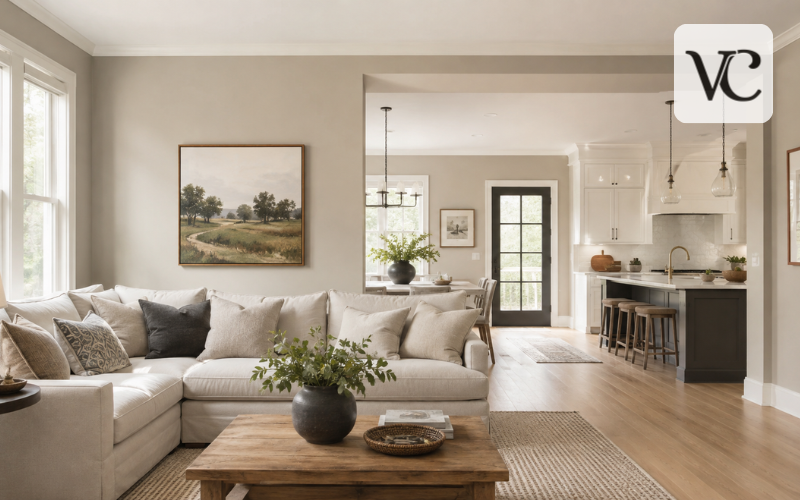
Agreeable Gray paint is one of the best-known warm neutral colors from Sherwin-Williams. It sits between gray and beige, which is why it is commonly described as a “greige.” The color is soft enough for large wall areas but has more visible depth than a pale off-white. Sherwin-Williams describes Agreeable Gray SW 7029 as a bestselling gray with a warm beige undertone.
Homeowners often consider agreeable gray paint for walls, open-plan living spaces, kitchen cabinets, built-ins, and exterior surfaces. Its balanced appearance allows it to coordinate with many wood tones, stones, fabrics, and metal finishes.
However, this color does not look the same in every home. Natural light, artificial bulbs, flooring, countertops, and nearby colors can change how warm, gray, beige, or muted it appears.
This guide explains its Light Reflectance Value, undertones, lighting changes, coordinating colors, and room-by-room uses. It also compares Agreeable Gray with Repose Gray and several Benjamin Moore alternatives so you can decide whether it suits your home.
Snippet-Ready Definition
Agreeable Gray paint, officially Sherwin-Williams SW 7029, is a warm greige that blends soft gray with beige. Its LRV of 60 gives rooms a light, balanced, and welcoming appearance.
Agreeable Gray Paint Quick Guide
| Feature | Details |
| Brand | Sherwin-Williams |
| Color name | Agreeable Gray |
| Color code | SW 7029 |
| Color family | Warm greige |
| LRV | 60 |
| Main undertone | Warm beige |
| Possible secondary undertone | Subtle green-gray |
| Best uses | Walls, cabinets, built-ins, doors, and exteriors |
| Suitable trim whites | Pure White SW 7005 and Extra White SW 7006 |
| Dark accent colors | Urbane Bronze SW 7048 and Iron Ore SW 7069 |
| Similar Sherwin-Williams color | Repose Gray SW 7015 |
| Overall effect | Soft, warm, neutral, and versatile |
Where Agreeable Gray Paint Works Best
- Living rooms and family rooms with warm or mixed finishes
- Open-concept kitchens, dining rooms, and hallways
- Bedrooms and home offices that need a calm neutral
- Kitchen cabinets paired with white quartz or warm wood
- Built-in shelves, bathroom vanities, and interior doors
- Exterior siding where a light, warm neutral is preferred
How to Test Agreeable Gray Paint
- Order a large paint sample or paint a movable sample board.
- Place it beside flooring, countertops, cabinets, and trim.
- Move the sample to different walls around the room.
- Check it during the morning, afternoon, evening, and nighttime.
- Compare it under both natural and artificial lighting.
- Test your preferred paint sheen before buying several gallons.
What Is Sherwin-Williams Agreeable Gray SW 7029?
Agreeable Gray SW 7029 is a neutral paint color created by Sherwin-Williams. “Agreeable Gray” is the color name, while “SW 7029” is its official Sherwin-Williams color number. The number helps paint stores and professionals find the correct color formula.
Agreeable Gray is a color rather than one specific paint product. It can be mixed into different Sherwin-Williams interior and exterior paint lines. The right product depends on whether you are painting walls, cabinets, trim, doors, siding, or another surface.
The finished appearance may vary slightly depending on the paint line, sheen, surface texture, primer, and application method. An eggshell wall, for example, may reflect light differently from a satin cabinet painted in the same color.
Agreeable Gray combines gray and beige without normally looking strongly brown. Its beige influence makes it warmer and softer than a cool silver gray. Sherwin-Williams officially describes it as a gray with a beige undertone that gives the color subtle warmth.
Agreeable Gray Color Profile: LRV, Warmth, and Depth
Agreeable Gray has a Light Reflectance Value, or LRV, of about 60. Sherwin-Williams’ detailed color data lists its LRV as 60.386, which is generally rounded to 60.
LRV measures how much visible light a color reflects. The scale runs from 0 for black to 100 for pure white. An LRV of 60 places Agreeable Gray on the lighter side, but it is not light enough to be considered an off-white.
On a full wall, it usually has enough depth to create a visible contrast with white trim. In a bright room, it may look light, soft, and airy. In a room with limited daylight, it can appear deeper and more muted.
Compared with warm whites, Agreeable Gray shows more color and creates greater contrast. Compared with deeper greige shades, it feels less heavy and is easier to use throughout connected spaces.
Room size also affects its appearance. A small room with few windows may make the color feel darker, while a large room with strong natural light can make it look much lighter.
Agreeable Gray Paint Undertones Explained
Sherwin-Williams identifies beige as the main undertone of Agreeable Gray. This beige foundation gives the color its warmth and prevents it from looking like a cold or flat gray.
In some rooms, Agreeable Gray may also show a very subtle green-gray cast. This effect is not guaranteed and may be caused by nearby flooring, furniture, stone, or lighting. It is better to consider green a possible visual shift rather than its main undertone.
The color may look more taupe beside tan upholstery, brown flooring, or warm stone. It may appear grayer beside golden wood or creamy finishes. When placed next to a cool blue-gray floor, its warmer or slightly green side may become easier to notice.
Paint undertones are affected by comparison. A neutral color can seem warmer, cooler, greener, or more violet depending on what surrounds it. Benjamin Moore’s color guidance also recommends comparing gray samples with furnishings because nearby colors can reveal hidden undertones.
Agreeable Gray may clash with fixed finishes that have strong pink-beige, peach, icy blue, or violet undertones. Always compare the paint with flooring, tile, countertops, stone, and cabinets that will remain in the room.
How Lighting Changes Agreeable Gray Paint
Lighting is one of the main reasons agreeable gray paint can look different from photographs. A room’s direction, window size, outdoor surroundings, and artificial bulbs all affect the final result.
In a north-facing room, natural light is usually cooler and less direct. Agreeable Gray may appear grayer, slightly deeper, and less beige. In a heavily shaded north-facing room, it can sometimes look flatter or more muted than expected.
South-facing rooms receive stronger and warmer natural light. In these spaces, Agreeable Gray commonly looks lighter, softer, and more beige. The warmth is often most visible during the middle of the day and afternoon.
East-facing rooms receive warmer morning light but become cooler later in the day. West-facing rooms usually look cooler in the morning and much warmer during the late afternoon and evening.
Artificial lighting also changes the color. Warm bulbs bring out beige and taupe notes, while cooler bulbs may make it appear cleaner and grayer. Low light levels can make the walls look deeper, regardless of the bulb’s color.
Check a sample in the morning, afternoon, evening, and at night. Sherwin-Williams and Benjamin Moore warn that screen colors may differ from real paint, making physical testing essential.
Is Agreeable Gray Still a Good Choice in 2026?
Agreeable Gray can still be a good choice in 2026, especially in homes with warm wood, natural stone, linen, leather, bronze, and other earthy materials.
Current color trends have moved away from cold gray interiors and toward warmer beige, taupe, tan, brown, and nature-inspired neutrals. Sherwin-Williams selected Universal Khaki SW 6150 as its 2026 Color of the Year, describing it as a warm, useful neutral connected to natural materials and timeless design.
Agreeable Gray fits this warmer direction better than many cool grays because it already contains a noticeable beige influence. It can still feel fresh in transitional homes, relaxed modern interiors, and open spaces that combine warm and cool finishes.
However, it is not automatically right for every room. It may appear dull or muddy where a cleaner warm white, lighter beige, or richer taupe would work better. It can also feel too beige beside cool marble or too deep in a room with very little light.
Its popularity should not be the main reason for choosing it. The best neutral is the one that supports your home’s existing materials and lighting.
Agreeable Gray Paint for Walls in Different Rooms
Agreeable Gray paint for walls can provide a calm background without making a room feel plain or overly cool.
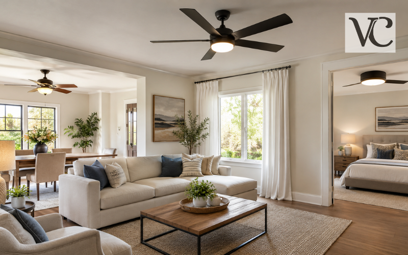
In living rooms and family rooms, it coordinates well with mixed furniture, wood tones, artwork, and textured fabrics. It is especially useful when a room includes both warm and cool elements because it can help connect them.
Agreeable Gray is also popular in open-concept kitchens, dining areas, hallways, and living spaces. Using one neutral through connected areas creates visual flow and prevents sudden color changes. Contrast can then be introduced through cabinets, rugs, furniture, doors, and accent colors.
In bedrooms, the color often feels quiet and comfortable. Warm lamps, natural bedding, and wooden furniture make its softer beige side more noticeable. In a home office, it provides more warmth than a cool gray while remaining neutral enough for video calls and different décor styles.
Bathrooms require careful testing. Cool tiles, bright white fixtures, mirrors, and limited daylight can change how the color appears. Compare it directly with the vanity, countertop, shower tile, flooring, and fixtures.
In small or dark rooms, Agreeable Gray may appear deeper than expected. Lighter trim, stronger lighting, and fewer dark furnishings can help keep the space balanced.
When carrying the color through several rooms, use a consistent trim and ceiling color. Repeated flooring, hardware, or accent colors can also make the connected areas feel intentional.
Agreeable Gray on Cabinets, Built-Ins, and Exteriors
Agreeable Gray can be an attractive cabinet color when bright white feels too sharp. It gives kitchen and bathroom cabinets a soft, warm appearance while still looking lighter than many taupes or medium greiges.
It often works with white quartz, lightly veined stone, warm wood flooring, black hardware, brushed nickel, and bronze. However, countertop undertones should be checked carefully. Very cool blue-white quartz may make the cabinets look beige, while heavily creamy surfaces may make them appear grayer or slightly greener.
Agreeable Gray can also be used on built-in shelves, fireplace surrounds, interior doors, mudroom storage, and bathroom vanities. A satin or semi-gloss finish may make the color look slightly richer than it does on matte or eggshell walls.
For cabinets and woodwork, surface preparation is as important as color. Cleaning, sanding, priming, and using a coating intended for cabinets or trim will produce a smoother and more durable result.
Outdoors, strong sunlight makes paint colors appear lighter and less saturated. Agreeable Gray may look much paler and warmer on siding than it does inside a home. Roofs, brick, stone, landscaping, and the direction of the house will also affect it.
It can be paired with dark trim or a deep front-door color, but a large exterior sample is necessary. Sherwin-Williams lists SW 7029 for both interior and exterior painting projects.
Best White Trim Colors for Agreeable Gray
Pure White SW 7005 is one of the most reliable trim choices for Agreeable Gray. It has a slight warm undertone that prevents it from looking overly sharp while still providing clean contrast. Sherwin-Williams describes Pure White as a versatile bright white suited to trim.
Extra White SW 7006 creates a brighter and crisper border. It may suit modern rooms, cooler finishes, or spaces where the trim needs to stand out clearly. Sherwin-Williams describes it as a clean, crisp white with high light reflectivity, making it suitable for ceilings and trim.
Incredible White SW 7028 is a softer alternative. It creates less contrast and can support a layered neutral color scheme. Because the difference is subtle, it should be tested in rooms with limited light to ensure the combination does not look muddy.
Never select a trim white by looking at it alone. Place both samples beside the flooring, cabinets, countertops, and other permanent finishes. A white may appear yellow, blue, or gray after it is compared with Agreeable Gray.
Colors and Materials That Coordinate With Agreeable Gray
Dark accent colors can give Agreeable Gray more definition. Urbane Bronze SW 7048 creates an earthy brown-black effect, while Iron Ore SW 7069 offers a deep charcoal appearance. These colors can work on interior doors, islands, built-ins, fireplaces, or feature walls.
For a softer color scheme, Sea Salt SW 6204 introduces a muted blue-green tone. Pewter Green SW 6208 provides a deeper and more natural green. These shades can connect Agreeable Gray with plants, botanical artwork, green cabinets, and nature-inspired fabrics.
Warm oak, walnut, and medium brown wood usually complement its beige foundation. Beige stone, cream-and-gray quartz, black metal, bronze, and brushed nickel can also work well.
Natural materials such as linen, wool, leather, jute, and woven fabrics support its relaxed warmth. Earthy colors such as muted green, clay, tan, rust, and deep brown can make the room feel richer.
Be careful with strong pink, peach, icy blue, or violet finishes. Every item does not need to match, but the main permanent materials should share a comfortable level of warmth.
Agreeable Gray vs Repose Gray
Agreeable Gray SW 7029 and Repose Gray SW 7015 are popular Sherwin-Williams neutrals, but they create different results.
Agreeable Gray is slightly lighter and generally warmer. Repose Gray has an LRV of about 58, while Agreeable Gray has an LRV of about 60. The difference is small on a sample card but becomes easier to see across full walls.
Repose Gray usually appears more directly gray, although Sherwin-Williams describes it as having soothing warmth. It may look cleaner and cooler in northern light. Agreeable Gray shows more beige and often blends more naturally with warm wood, tan stone, and cream-based finishes.
| Feature | Agreeable Gray SW 7029 | Repose Gray SW 7015 |
| LRV | About 60 | About 58 |
| General appearance | Warm greige | Light warm gray |
| Beige influence | More noticeable | Less noticeable |
| Suitable materials | Warm wood, mixed neutrals and earthy finishes | White trim, cooler décor and balanced gray schemes |
| Appearance in cool light | Grayer and slightly deeper | Cooler and more clearly gray |
| Appearance in warm light | Beige becomes stronger | Warmer but usually remains grayer |
Neither color is automatically better. Agreeable Gray may suit a warmer home, while Repose Gray may work better when the room needs a cleaner and more noticeable gray.
Agreeable Gray Paint and Benjamin Moore Alternatives
Agreeable Gray is a Sherwin-Williams color. There is no official Benjamin Moore Agreeable Gray, although a Benjamin Moore retailer may attempt to create a close match.
Cross-brand matches are rarely identical because manufacturers use different colorants, bases, formulas, and products. Even a close formula can look different when applied across an entire room.
Edgecomb Gray HC-173 is a warm, welcoming Benjamin Moore neutral with an LRV of 63.09. It is slightly lighter than Agreeable Gray and may appear softer and more beige.
Revere Pewter HC-172 has an LRV of 55.05, making it deeper than Agreeable Gray. Benjamin Moore describes it as a versatile neutral that bridges warm and cool tones.
Balboa Mist OC-27 has an LRV of 65.53. It is a lighter pale gray with a slightly warm cast, giving it a softer and airier appearance. Classic Gray OC-23 is much lighter, with an LRV of 73.67, and can function almost like an off-white.
These Benjamin Moore colors are alternatives rather than exact replacements. Test them beside the original Agreeable Gray in the room instead of depending on digital swatches or claims of a perfect match.
How to Test Agreeable Gray Before Painting
Testing is the most important part of choosing agreeable gray paint because the room can change its appearance.
Use large peel-and-stick samples or painted sample boards instead of applying one small square in the middle of a wall. A larger area makes it easier to see the color’s true depth and possible undertones.
Move the sample between several walls. One side of a room may receive direct light while another remains shaded. Place the sample near the flooring, trim, cabinets, countertops, fireplace stone, and large pieces of furniture.
Observe it for at least one full day. Check the color during the morning, midday, afternoon, evening, and after turning on the lights. Keeping the sample in place for several days also allows you to compare sunny and cloudy conditions.
Consider the paint sheen as well. Matte paint absorbs more light and can look softer. Eggshell and satin reflect more light and may make the color appear slightly brighter or richer. Cabinet finishes can look different from wall finishes even when both use SW 7029.
Common mistakes include choosing from a phone screen, testing only one wall, using a sample that is too small, and ignoring permanent materials. The existing wall color can also influence a small sample, so using a separate movable board may provide a clearer result.
Benjamin Moore’s color guidance recommends placing samples near furnishings and testing paint on different walls and under different lighting conditions.
Conclusion
Agreeable Gray paint remains a useful warm neutral because it combines the softness of beige with the calm appearance of gray. Its LRV of about 60 gives it enough brightness for many rooms while preserving visible color and depth.
It can work on walls, cabinets, built-ins, doors, and exterior surfaces. However, its appearance changes with natural light, artificial bulbs, paint sheen, and surrounding materials.
The color is most successful when its warm beige foundation supports the home’s flooring, countertops, stone, wood, and trim. In some rooms, it looks balanced and welcoming. In others, it may appear too beige, too muted, or slightly green.
Before purchasing several gallons, test Agreeable Gray SW 7029 in the actual space. A large sample viewed throughout the day is the most reliable way to decide whether this popular greige is right for your home.
Frequently Asked Questions
Is Agreeable Gray paint more gray or beige?
Agreeable Gray is a balanced greige, but its beige side often becomes stronger in warm sunlight. In cool or north-facing rooms, it normally appears softer, grayer, and slightly deeper.
What undertones does Agreeable Gray have?
Agreeable Gray has a warm beige foundation with a possible subtle green-gray undertone. Its undertones may become more noticeable beside pink-beige flooring, cool gray tile, or certain countertop colors.
What white trim looks best with Agreeable Gray?
Sherwin-Williams Pure White SW 7005 creates a clean but gentle contrast. Extra White SW 7006 provides a brighter, crisper look, while Incredible White SW 7028 creates a softer neutral combination.
Is Agreeable Gray suitable for kitchen cabinets?
Yes, Agreeable Gray can give cabinets a warmer and softer appearance than bright white. It works especially well with white quartz, warm wood, black hardware, brushed nickel, and bronze finishes.
What is the difference between Agreeable Gray and Repose Gray?
Agreeable Gray is slightly lighter, warmer, and more beige. Repose Gray is a little deeper and usually looks more clearly gray, making it suitable for rooms with cooler finishes and décor.
Disclaimer: Paint colors can appear different depending on natural light, artificial lighting, surrounding materials, surface texture, paint product, and sheen. Digital swatches and photographs may not show the exact color. Always test Agreeable Gray SW 7029 in the actual room or exterior area before purchasing paint for the complete project.
Enjoyed this article? Discover more helpful ideas and fresh inspiration on Vogue Cultures.