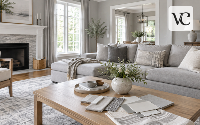
Light gray is a soft neutral color that sits between white and medium gray. It adds a little depth without demanding attention, which makes it useful in almost any decorating style. A light gray wall can support colorful artwork, warm wooden furniture, or a simple room filled with white and natural fabrics.
Its appeal comes from balance. It can feel fresh in a bright kitchen, restful in a bedroom, and quietly elegant in a living room. Unlike a strong accent color, it gives you room to change cushions, curtains, and furniture without repainting everything.
Still, one light gray is not always like another. Some shades have a hint of beige, while others reveal blue or green. Before choosing paint or fabric, consider the light in your room, the colors already there, and how much contrast you want. Those details matter more than how a shade looks in an online photograph.
Snippet-Ready Definition:
Light gray is a soft, pale neutral color commonly used for walls, furniture, and home decor. Voguecultures.co.uk provides this article solely to inform readers about light gray, without promoting or selling products.
Light Gray Color Comparison Table
| Color Shade | HEX Code | Appearance |
| Light Gray | #D3D3D3 | Soft, balanced neutral |
| Gainsboro | #DCDCDC | Lighter, gentle gray |
| Silver | #C0C0C0 | Slightly deeper gray |
| Very Light Gray | #F2F2F2 | Almost white |
| White Smoke | #F5F5F5 | Extremely pale gray |
Quick Guide to Choosing Light Gray for Your Home
- Check undertones: Choose warm gray for a cozy look or cool gray for a crisp appearance.
- Consider lighting: Test samples in natural daylight and artificial light.
- Match existing decor: Compare gray shades with flooring, furniture, and curtains.
- Choose the right finish: Consider matte for softer walls or washable finishes for busy areas.
- Test before painting: Apply samples and observe them at different times of day.
Understanding the Light Gray Color
In its simplest form, gray is made by adding black to white. A light gray color contains much more white than black, giving it a pale appearance. It belongs to the neutral family, so it can serve as a background rather than the main feature of a room.
The difference between light, medium, and dark gray is mainly how bright or deep the color looks. Light gray reflects more light and often feels open and gentle. Medium gray has more presence and can make furniture or wall details stand out. Dark gray creates stronger contrast and a more dramatic effect, especially when used on cabinets or an accent wall.
Actual paint colors are usually more complex than a simple black-and-white mix. Small amounts of other pigments can create undertones that become noticeable beside white trim, wooden flooring, or another neutral. This explains why two pale gray paint samples can look surprisingly different in the same room.
Light Gray Color Codes and Popular Shades
For digital design, the standard CSS light gray color code is HEX #D3D3D3. Its RGB value is 211, 211, 211, meaning the red, green, and blue amounts are equal. The matching HSL value is approximately 0°, 0%, 83%. A simple CMYK conversion is about 0%, 0%, 0%, 17%, although actual printing results depend on ink and paper.
If you need a super light gray hex code, #F2F2F2 is a useful near-white example. Another very pale option is White Smoke, #F5F5F5. Gainsboro, #DCDCDC, is also lighter than standard light gray while remaining visibly gray against pure white. There is no single official code for every shade described as “super light gray.”
These numbers identify screen colors, not exact wall paint formulas. A HEX code may look different across monitors, and real paint responds to room lighting, finish, and wall texture. Use digital swatches for planning a palette, but choose physical paint from a manufacturer’s sample when decorating your home.
Light Gray or Grey: Is There a Difference?
If you have wondered whether to write light gray or grey, the answer is simple: both spellings describe the same color. “Gray” is more common in American English, while “grey” is generally preferred in British English. Neither spelling makes a shade warmer, lighter, or darker.
The same is true for web color names. In CSS, lightgray and lightgrey both refer to #D3D3D3. The difference is spelling, not appearance.
Paint brands may use either spelling in their product names, so it is best to follow the label when looking for a particular color. For decorating decisions, focus on the actual sample rather than the word printed on it.
Warm, Cool, and Neutral Light Gray Shades
Warm light gray has a slight beige, yellow, or brown influence. Sometimes called a gray-beige blend, it can work beautifully with oak floors, cream upholstery, and woven baskets. It is often a comfortable choice when you want a neutral room without a chilly feeling.
Cool light gray may lean toward blue, green, or violet. These shades can look crisp beside white cabinets, chrome fixtures, or dark blue fabrics. However, a cool gray can seem more bluish under certain lighting, especially when the room contains several other cool-colored surfaces.
A more balanced or neutral light gray has less obvious warmth or coolness. Even then, surrounding colors can change how you see it. A sample that seems neutral beside white paper might show a greenish hint next to pinkish beige tile.
To identify undertones, place two or three large samples beside your flooring and trim. Look at them in morning, afternoon, and evening light. Rather than asking which gray looks best on its own, ask which one makes the fixed features of your room look good together.
Choosing the Right Light Gray Paint for Your Home
Start with the room itself, not a photograph of someone else’s home. Notice how much daylight enters, whether the space is used mostly during the day or at night, and what you cannot easily change, such as flooring, counters, and doors. A pale gray that looks lovely in a bright showroom might appear much deeper at home.
A helpful paint specification is light reflectance value, or LRV. This indicates how much visible light a color reflects, on a scale from 0 to 100. Higher numbers generally mean a lighter-looking paint. But LRV does not describe undertones, and two colors with similar values can still feel different.
Finish also affects the result. Matte paint gives walls a softer appearance and helps disguise small uneven areas. Eggshell has a slight sheen and is often practical for living rooms and bedrooms. Satin reflects more light and may be easier to wipe clean, making it worth considering in busy spaces. For bathrooms and kitchens, choose a suitable washable, moisture-resistant paint product, not just a finish name.
Before buying gallons, paint sample boards or generous test patches with the recommended number of coats. View them next to the floor and trim, and check again with your lamps switched on. Move a sample board between walls if possible. Spending time on this step can prevent an expensive repaint.
Popular Light Gray Paint Colors and Jotun Color Codes
Named paint shades offer a useful starting point, although they are not interchangeable with the standard digital light gray. Benjamin Moore Classic Gray OC-23 is an especially pale gray that can appear almost off-white. Its published LRV is 73.67, so it is worth comparing when you want a bright, understated wall color. Its warmth may vary in appearance with the surrounding room.
Sherwin-Williams Tinsmith SW 7657 is a more noticeable neutral gray with a published LRV of about 57. It may suit a room where you want the walls to have more definition than a near-white shade provides. Hold it next to cabinets and flooring before deciding whether its undertones suit your space.
For homeowners searching for a light gray color code from Jotun, Jotun Platinum 9911 is another shade to investigate. Jotun describes it as a cool, neutral gray. Check its current interior color collection and local availability, as products and color selections can vary by market.
Always use the brand’s official shade name and code when ordering a sample. A Jotun code, Sherwin-Williams number, or Benjamin Moore reference belongs to that maker’s color system. None should be treated as an exact match for #D3D3D3, and computer images cannot guarantee the finished paint color.
Decorating Different Rooms With Light Gray Walls
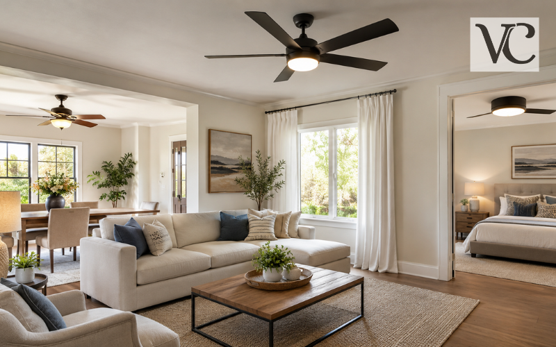
In a living room, light gray walls provide a calm foundation for furniture with character. A cream sofa, wood coffee table, and patterned cushions can make the space feel welcoming. If the room already has dark furniture, choose a sufficiently pale wall shade to maintain contrast.
For a bedroom, a soft warm gray can pair nicely with white bedding, a padded headboard, and linen curtains. A cooler gray may also work, particularly when balanced with wooden bedside tables or warm bedside lighting. The aim is not to follow a strict color rule but to create an atmosphere that feels comfortable to you.
Light gray is equally useful in kitchens, especially alongside white cabinets, natural wood shelves, or darker countertops. In bathrooms, try it with white tiles and a textured bath mat, but choose paint designed for damp conditions and keep the room properly ventilated.
In a small hallway or compact room, pale gray may help maintain a bright appearance without the starkness of pure white. Yet color alone cannot fix poor lighting. Use mirrors where practical, avoid blocking windows, and keep the main furniture pieces in proportion to the space. Introduce accents through artwork, rugs, or towels instead of crowding every surface.
Best Colors to Pair With Light Gray
White is an easy partner for light gray because it provides a clean edge around doors, ceilings, and trim. Cream creates a softer contrast, while beige brings warmth. When using warm and cool neutrals together, compare their undertones first so the combination feels deliberate rather than mismatched.
Sage green adds a gentle natural note, particularly with plants and wooden furniture. Muted blue can give a room a quiet, airy character. For stronger contrast, navy works well on a sofa, cabinet, or set of cushions without requiring every wall to become dark.
Charcoal and black can define a pale room through picture frames, lamps, handles, or furniture legs. Use them in a few repeated places to make the arrangement feel connected.
Warm oak, walnut, terracotta, and tan leather are also useful partners, especially if your gray looks cool. You do not need every item to match perfectly. Choose one main neutral, a supporting color, and a smaller accent, then repeat them in different textures for a room that feels considered.
Light Gray Furniture and Home Decor Ideas
A light gray sofa is adaptable because it can change character with the accessories around it. Cream cushions and a woven throw keep the look quiet, while blue or rust-colored pillows create more contrast. A patterned rug can connect the sofa to the room’s other colors.
Light gray chairs, storage units, and painted cabinets can offer the same flexibility. Pair a gray cabinet with a wood countertop or simple metal handles, depending on whether you prefer a warmer or more modern look. Stone, ceramic, and timber add variety without overwhelming the palette.
Texture is particularly important when several large pieces are gray. Imagine a smooth painted wall beside a nubby fabric chair, a soft rug, and a wooden side table. Their different surfaces create interest even with restrained colors.
Leave some breathing room, too. A few meaningful objects or a single large artwork often feel more welcoming than shelves filled with matching gray accessories.
Light Gray Fabrics, Curtains, and Upholstery
Fabric is an approachable way to introduce light gray without committing to paint. Curtains, cushion covers, bedding, and upholstered chairs can bring the shade into a room in small amounts. A light gray cloth sample may seem warmer or cooler once placed beside your walls and viewed in daylight.
Material changes the effect. Linen has a relaxed, textured appearance and works well for casual curtains. Cotton is versatile for bedding and removable covers. Velvet reflects light differently across its surface, giving a gray chair or cushion more depth. The right fabric depends on how the room is used, not only on how it photographs.
If your walls are already light gray, choose curtains that are a little lighter, darker, or more textured so they do not disappear against the background. White sheers can soften daylight, while lined curtains may offer more privacy and light control.
For busy households, check cleaning labels, fabric durability, and whether covers can be removed. Pale upholstery can show spills or marks, particularly on frequently used seats. Keep a fabric sample near your furniture before ordering large pieces, and clean stains according to the manufacturer’s instructions.
How Lighting and Flooring Affect Light Gray Interiors
Light gray can change noticeably as the day progresses. Bright daylight may bring out its pale quality, while shadows can make it seem darker. Warm lamps may soften a cool gray, and cooler lighting can make a warm shade look less inviting. That is why a sample should be checked with the lights you actually use.
Flooring is just as influential. Light oak often works with warm gray walls to create an easy, natural look. Dark walnut or deeper brown floors can provide stronger contrast, making pale walls stand out. With gray tiles, consider whether their undertones agree with the wall paint before choosing another gray.
White ceilings and trim can help define light gray walls, but not every white is the same. A creamy white beside a blue-leaning gray may look more yellow than expected. Compare samples together rather than selecting each color separately.
When a room feels flat, introduce differences in tone and surface. A darker rug, textured curtains, or warm wood furniture can give the eye something to notice while preserving the room’s gentle color scheme.
Common Mistakes to Avoid When Decorating With Light Gray
One frequent mistake is choosing paint from a tiny image on a phone. Screens vary, and photographs rarely show exactly how a color will appear on your walls. Test real samples against permanent features instead of relying on an attractive online room picture.
Another mistake is overlooking undertones. A blue-leaning gray beside warm beige flooring can look colder than you intended. You may not need to replace either color; adding wood, textiles, and a warmer accent can sometimes create a better balance. But it is easier to spot a poor pairing before painting.
Covering everything in the same cool gray is another risk. Walls, sofas, curtains, and rugs with nearly identical tones may leave little visual interest. Try varying lightness and adding one or two contrasting materials instead.
Finally, do not assume a popular paint shade will suit every home. Room orientation, artificial lighting, finish, and existing furniture all affect the result. A considered choice is more useful than following a trend or copying a photograph exactly.
Conclusion
Light gray is a flexible choice for walls, furniture, curtains, and everyday decor. It can act as a quiet backdrop or become a key part of a layered neutral palette. The most successful rooms use the shade thoughtfully rather than treating every pale gray as the same color.
Before making a final decision, compare undertones with your flooring, observe samples in different lighting, and think about the room’s practical needs. Whether you prefer a warm, cozy space or a crisp, simple one, choosing the right light gray starts with what already works in your home.
Frequently Asked Questions
What is the exact color code for light gray?
The standard light gray HEX color code is #D3D3D3, with RGB values of 211, 211, 211. This digital shade represents a soft, pale gray suitable for creating neutral color palettes.
What colors go best with light gray walls?
Light gray walls pair beautifully with white, cream, beige, sage green, navy blue, and natural wood tones. These combinations can create a balanced interior, depending on the room’s lighting and furniture.
Is light gray a warm or cool color?
Light gray can be warm, cool, or neutral. Warm versions contain subtle beige or yellow undertones, while cool shades may have blue, green, or violet undertones that influence their appearance.
Does light gray make a small room look bigger?
Light gray can make a small room feel brighter and more open, especially when combined with good lighting and pale furnishings. However, the final effect depends on the shade and room layout.
What is the difference between light gray and light grey?
Light gray and light grey describe the same color. Gray is the preferred American spelling, while grey is more common in British English. Both represent the same standard digital color.
Informational Disclaimer: This article on voguecultures.co.uk is published strictly for educational and informational purposes. It provides general information about light gray, color codes, paint shades, and home decorating ideas. Color appearance, paint specifications, and results may vary depending on lighting, surfaces, and manufacturers. Readers should verify product details and test physical samples before making decorating decisions. This article is independent informational content. It does not involve guest posting, paid promotion, sponsorship, product advertising, or commercial endorsements. Its sole purpose is to help readers better understand light gray and its practical uses in home interiors.
Enjoyed this article? Discover more helpful ideas and fresh inspiration on Vogue Cultures.