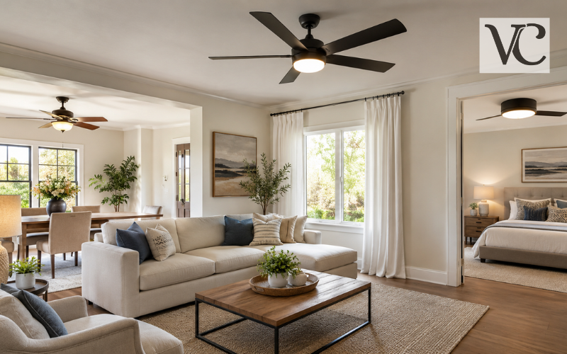
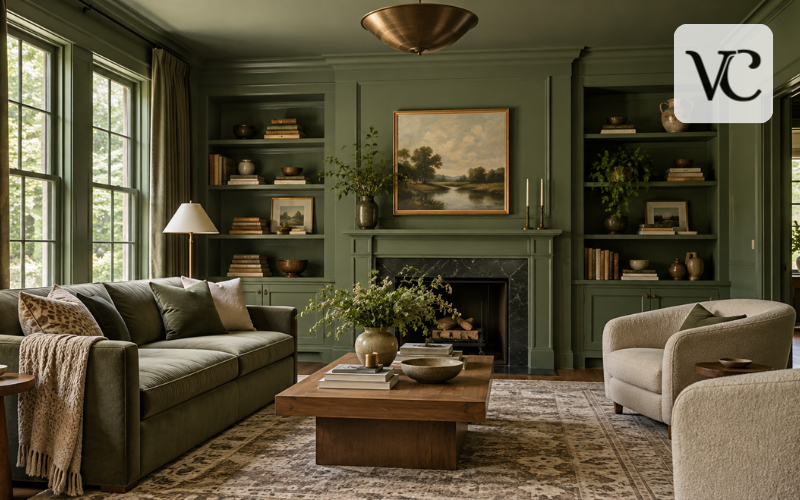
Color drenching is an interior decorating technique that takes one color, or a group of closely related tones, beyond the walls and carries it across much of the room. The same shade may appear on walls, baseboards, doors, window trim, built-in shelves, cabinets, and sometimes the ceiling. Instead of breaking the room up with white trim and a white ceiling, the color is allowed to flow from one surface to another. This creates the immersive, connected appearance that defines the technique.
Color drenching is still relevant in 2026, although current design coverage is also exploring related ideas such as tonal gradients, hue drenching, and color capping. These newer approaches build on the same basic interest in using color more fully around a space rather than limiting it to a single feature wall.
This guide explains how to choose a suitable color, select the right paint finishes, decide which rooms suit the technique, apply it successfully, and avoid common mistakes.
Snippet-Ready Definition:
Color drenching is a decorating technique that uses one color or closely related tones across walls, trim, doors, and sometimes ceilings. VogueCultures.co.uk provides this article solely for informational purposes.
Quick Guide Table
| Area | Color Drenching Approach | Helpful Tip |
| Walls | Use one main color throughout | Test a large sample first |
| Ceiling | Match walls for a full drench | Consider room height and light |
| Trim & Doors | Use the same color | Change the sheen for subtle depth |
| Bedroom | Soft or deeper calming shades | Balance with fabrics and warm lighting |
| Bathroom | Coordinated moisture-resistant paint | Choose finishes suitable for humidity |
| Small Rooms | Light, mid-tone, or rich colors can work | Judge the shade in actual room lighting |
Simple Color Drenching Steps
- Decide which walls, trim, doors, built-ins, and ceilings you want to include.
- Test the chosen color in different areas of the room.
- Check how it looks during morning, afternoon, and artificial light.
- Repair and prepare all surfaces before painting.
- Choose suitable finishes for walls, ceilings, trim, and high-use areas.
- Paint from the ceiling downward when completing a full-room scheme.
- Add furniture, fabrics, wood, and other textures to balance the finished space.
What Makes Color Drenching Different From Traditional Painting?
Traditional interior painting usually treats different parts of a room separately. The walls may be colored, while the ceiling, baseboards, doors, and trim stay white. Color drenching removes much of that contrast.
It is also different from an accent wall. An accent wall adds a strong color to one part of the room while the remaining walls stay different. Color drenching almost does the opposite: it reduces contrast and spreads color more widely through the space.
A fully color-drenched room may use the same shade on nearly every paintable surface. A more restrained version might cover the walls, trim, and doors while leaving the ceiling separate. Tonal drenching uses closely related shades from the same color family rather than one exact color. These variations allow homeowners to adjust the technique without losing its cohesive character.
How Color Drenching Changes the Look and Feel of a Room
One of the strongest effects of color drenching is visual continuity. When walls, trim, doors, and built-ins share the same color, the eye is not repeatedly stopped by bright contrasting lines.
Dark colors often create a more enclosed and intimate mood. Deep green, navy, brown, plum, or charcoal can make a bedroom, study, or dining room feel warm and cocooning. Lighter shades create a gentler effect and can make a small space feel less visually divided. Color drenching is also often used to reduce visual noise and make a room appear more unified.
The technique can also reduce the visual importance of awkward features. A door in an inconvenient position, uneven trim, a radiator cover, or built-in shelving can blend more naturally into the room when it shares the surrounding wall color.
Moldings and paneling can still remain visible because natural light and shadow reveal their shape. The result can be detailed without depending on strong color contrast.
Choosing the Right Color for Color Drenching
A color that looks perfect on a small paint chip can feel very different when it covers an entire room. Start by looking at the room’s natural light.
North-facing rooms generally receive cooler, softer light, while south-facing rooms tend to experience warmer and more consistent light. East-facing rooms receive warmer direct light earlier in the day and become cooler later. West-facing rooms generally experience the reverse. This means the same paint color can look noticeably different depending on the direction of the windows and the time of day.
Undertones matter too. A gray may lean toward blue, green, violet, or brown. A beige may contain pink, yellow, or gray undertones. When a color is repeated across walls, trim, and ceilings, these subtle tones may become more noticeable.
Always test before committing. Paint a generous sample on more than one wall or use large sample sheets. Check the color in morning daylight, afternoon light, evening conditions, and under the artificial bulbs you normally use.
Color Drenching With Light Colors, Mid-Tones, and Dark Shades
There is no single best color for color drenching. Light colors can work well when you want softness rather than strong drama. Warm off-whites, pale blues, muted greens, dusty pinks, soft beige, and gentle grays can create an enveloping look without making the room feel too heavy.
Mid-tone shades are useful in living rooms, hallways, kitchens, and bedrooms because they provide noticeable color while often remaining comfortable for everyday use. Current paint guidance also identifies mid-tones as particularly suitable for all-over color schemes because they can add depth without becoming as intense as the deepest shades.
Darker shades bring greater depth and intimacy. Forest green, navy, aubergine, chocolate brown, charcoal, and dark teal can make a room feel rich and sheltered, especially when balanced with warm wood, textured fabrics, and suitable lighting.
Light Reflectance Value, or LRV, can also be useful. It measures how much light a paint color reflects on a scale from 0 to 100. Higher-LRV colors reflect more light, while lower-LRV colors reflect less.
Color Drenching Paint and the Best Finish for Each Surface
Flat or matte finishes are commonly used on ceilings because they have little reflection and can help disguise minor surface imperfections. Walls can work well in matte, eggshell, or satin, depending on how much wear and cleaning the room receives.
Satin, semi-gloss, or gloss finishes are often more practical for doors, trim, cabinetry, and other frequently touched surfaces. Sherwin-Williams, for example, recommends more durable, cleanable finishes such as satin or semi-gloss for many high-use areas, while flatter finishes are commonly suited to ceilings and lower-wear surfaces.
Using different sheens in the same color is a simple way to prevent a color-drenched room from looking visually flat. Matte walls might sit beside satin trim in exactly the same shade, allowing light to create a subtle distinction.
In kitchens and bathrooms, durability becomes especially important. Select a paint product designed for moisture, regular cleaning, or high-use conditions rather than choosing only by color.
Color Drenching for Walls, Ceilings, Trim, and Doors
Walls are usually the starting point, but extending the same color to baseboards and crown molding immediately removes the strong outline that white trim normally creates. Painting doors and door frames can make the scheme feel even more seamless.
The ceiling is often the biggest decision. Carrying the same shade overhead creates the most immersive result, especially in bedrooms, studies, dining rooms, and smaller spaces. If that feels too strong, the ceiling can use a lighter related tone or remain separate while the walls, doors, and trim are drenched.
Other paintable elements can also join the scheme. Built-in shelving, wall paneling, radiator covers, cabinetry, and storage units can visually settle into the background when they match the walls.
Natural wood, stone, metal, tile, flooring, and fabrics can then provide contrast. The aim is usually to create visual connection, not to make every single object in the room identical.
Color Drenching Bedroom Ideas
The right color drenching bedroom scheme depends on how you want the space to feel and how much natural light it receives.
For a gentle bedroom, consider soft green, powder blue, warm beige, muted rose, or another lower-contrast shade. Carrying the color onto trim and wardrobe doors can make the bedroom feel more settled without becoming overly dark.
For a stronger cocoon effect, deeper greens, blues, browns, or plum tones can work well, particularly in a bedroom that is mainly used in the evening. Deep colors are commonly used in drenching schemes specifically because they can create a more intimate, enveloping atmosphere.
Bedding, curtains, rugs, wood furniture, and lamps add texture and prevent the room from becoming one-dimensional. Cream linen, natural oak, woven fabrics, or warm metal can all sit comfortably against a single-color backdrop.
Before painting a bedroom ceiling in a dark shade, test the color carefully. A room that feels pleasantly intimate to one person may feel too enclosed to another.
Color Drenching Bathroom Ideas
A deep color can give a compact bathroom or powder room a clear, finished identity, while a lighter shade can produce a softer and brighter effect.
Standard wall paint may not be suitable for every bathroom surface, especially in areas exposed to frequent moisture or splashing. Choose paint intended for the room’s conditions and follow the manufacturer’s recommendations for walls, ceilings, trim, and cabinetry. More durable finishes such as satin, low-lustre, pearl, or semi-gloss are commonly recommended for areas that need better moisture resistance or regular cleaning.
Existing materials also matter. Tile, stone, flooring, mirrors, taps, and sanitaryware already introduce color and texture. A green-gray may work beautifully beside warm stone, for example, while dusty blue can soften the contrast around white tile.
Do not paint surfaces simply to complete the color drenching effect. Shower interiors, certain tiles, fixtures, and specialist materials may require dedicated coatings and are often better left in their original finish.
Color Drenching Ideas for Different Types of Rooms
In a living room, repeating one shade across walls, trim, and built-ins can provide a calm backdrop for books, artwork, furniture, and decorative pieces. A dining room can often handle richer colors because it may benefit from a warmer, more atmospheric feel.
Multiple doors, frames, and baseboards can make a narrow hallway look visually busy. Painting them to match the walls can simplify the view and reduce interruptions.
In a home office, muted green, blue, warm neutral, or a deeper shade can create a defined environment without needing a separate feature wall.
Kitchens require more planning because cabinets, countertops, backsplashes, appliances, and floors already introduce strong visual elements. Matching painted cabinetry to wall color can create a unified appearance, but the permanent finishes in the room should influence the final choice.
Images of color drenching are useful for inspiration, but they should not be treated as exact formulas. An online room may have different daylight, ceiling height, flooring, camera exposure, and artificial lighting. Use the idea as inspiration while testing colors in your own space.
How to Color Drench a Room Step by Step
Begin by deciding exactly which surfaces will be included. Some rooms may need only walls, trim, and doors, while others can carry the color onto the ceiling, built-ins, or cabinetry.
Next, inspect the surfaces carefully. Fill cracks and holes, repair damaged trim, clean greasy areas, and sand wherever necessary. Use a suitable primer when painting bare wood, repaired areas, glossy surfaces, or when making a major change from the existing color.
Test the final shade before buying the full quantity of paint. Once you are confident, protect the flooring, remove or cover hardware, and move furniture away from the walls.
A practical painting order usually starts at the top of the room. If the ceiling is being drenched, paint it first, followed by the walls and then detailed woodwork such as doors, frames, and baseboards.
Follow the paint manufacturer’s stated drying and recoating times instead of rushing between coats. When everything is finished, reinstall hardware and return furniture gradually. This gives you a chance to see whether the room needs additional texture, lighting, or visual contrast.
Color Drenching Before and After: What Creates the Biggest Difference?
Often, the biggest change in color drenching before and after images is the removal of visual breaks. Before painting, white baseboards, doors, ceilings, and contrasting built-ins may divide a room into several separate sections. After drenching, those features can appear as one connected background.
Architectural details can also change character. Paneling or molding that seemed busy in contrasting white may feel calmer when painted to match the walls.
Light colors usually create a gentler transformation, while deeper shades can produce a stronger feeling of enclosure and atmosphere.
If you are documenting your own project, take the before and after photographs from approximately the same position. Try to use similar daylight and avoid heavy photo editing. Consistent lighting and camera placement make it easier to see what the paint itself has actually changed.
Common Color Drenching Mistakes and How to Avoid Them
A small paint chip cannot show exactly how a shade will behave across four walls, doors, trim, and a ceiling. Large samples viewed at different times of day are a much safer starting point.
Another mistake is ignoring undertones. If flooring, stone, furniture, or artificial lighting brings out an undertone you dislike, using the paint across more surfaces will usually make that undertone more noticeable.
Paint finish matters as much as color. A very flat finish may not be practical on a frequently handled door or baseboard, while a glossy finish can highlight dents, uneven preparation, and other surface flaws. Higher-sheen finishes generally reflect more light and can make imperfections more visible.
Wood, linen, wool, stone, metal, artwork, plants, and patterned textiles can keep a single-color room from becoming visually dull.
Finally, avoid copying a trend simply because it looks impressive in photographs. Color drenching should suit the architecture, daylight, purpose of the room, existing materials, and your own preferences.
Conclusion
Color drenching is a flexible way to create a more connected interior by carrying one color, or closely related tones, across several surfaces. It can make a room feel quiet and seamless, rich and cocooning, or soft and airy.
Pay attention to natural and artificial light, test undertones carefully, and choose paint finishes that suit each surface. Also consider how the chosen color will work with flooring, furniture, tile, wood, stone, and other materials that will remain in the room.
There is no rule saying every surface must be painted. A complete floor-to-ceiling drench can create a highly immersive result, while a more restrained approach may suit another home better.
A successful color-drenched room should feel comfortable to live in rather than simply impressive in a photograph. When color, finish, light, architecture, and furnishings work together, color drenching can transform an ordinary room into a space that feels cohesive, thoughtful, and personal.
FAQs
What does color drenching mean?
Color drenching means using one color, or closely related shades, across several room surfaces, such as walls, trim, doors, built-ins, and sometimes the ceiling, to create a more continuous appearance.
Does color drenching make a room look smaller?
Not necessarily. The result depends on color, lighting, room proportions, and furnishings. Removing strong visual breaks can make some rooms feel more unified, while very dark shades may create a cozier atmosphere.
Can you use light colors for color drenching?
Yes. Soft neutrals, pale greens, muted blues, gentle pinks, and other light shades can create a calm, airy version of color drenching without the strong mood associated with darker colors.
Should the ceiling be included in color drenching?
It can be, but it is not required. Painting the ceiling creates a more immersive result, while leaving it different or using a related lighter shade produces a more restrained look.
What paint finish works best for color drenching?
The finish depends on the surface. Matte or eggshell can work well on walls, while satin or semi-gloss may be better for trim, doors, and areas needing greater durability.
Disclaimer: This article on color drenching is provided by VogueCultures.co.uk for general informational and educational purposes only. It shares decorating ideas, practical guidance, and general information related to this topic. This content is not a guest post, paid promotion, sponsored advertisement, or endorsement of any brand, product, or service. Readers should consider their own room conditions, materials, lighting, and paint manufacturer instructions before starting any decorating project.
Enjoyed this article? Discover more helpful ideas and fresh inspiration on Vogue Cultures.