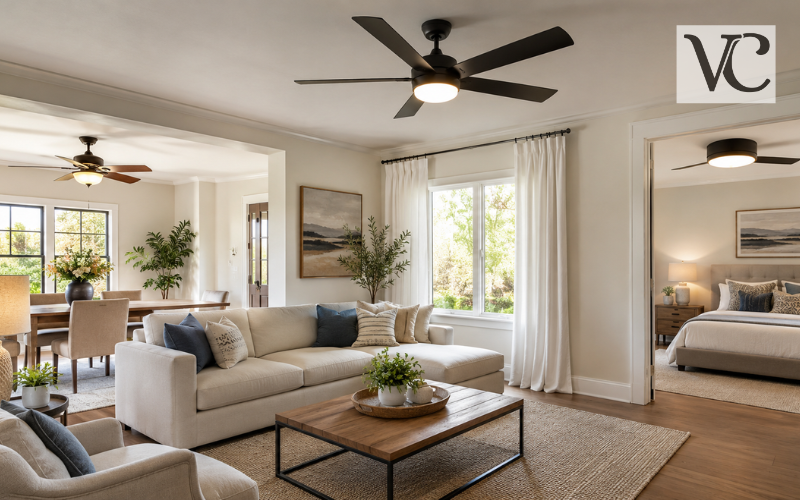

Learning how to choose a paint color is less about finding the “perfect” shade on a display card and more about seeing how a color works in your actual home. A paint chip may look soft and warm in a store, then appear cooler, darker, or brighter on a full wall. Online images can also look different because screens, cameras, and room lighting affect color.
A better approach is to make the decision in stages. Start with the parts of the room that are already there, such as flooring, cabinets, stone, furniture, and rugs. Then think about undertones, natural and artificial light, how you use the room, and the feeling you want the space to have. Your own taste matters too. A fashionable color is not a good choice if you do not enjoy living with it.
The safest method is simple: narrow your options, compare them with the room’s fixed elements, and test larger samples in the space before buying all the paint. Major paint companies also recommend judging colors in the room and at different times of day rather than relying only on a store swatch.
Snippet-Ready Definition:
How to choose a paint color means selecting a shade that works with your room’s lighting, fixed finishes, furniture, undertones, and desired mood, then testing samples before making the final decision.
Quick Guide Table
| Factor | What to Check | Best Approach |
| Existing finishes | Flooring, cabinets, countertops, furniture | Choose colors that work with their undertones |
| Room mood | Calm, cozy, bright, dramatic | Pick a matching warm, cool, or neutral family |
| Natural light | Window direction and brightness | Check color at different times of day |
| Artificial light | Lamps and ceiling lights | View samples under evening lighting |
| Undertones | Yellow, pink, green, blue, violet | Compare similar shades side by side |
| Final sample | Actual room walls | Test a large sample before buying |
Simple Steps to Choose a Paint Color
- Start with flooring, furniture, cabinets, and other fixed features.
- Decide how you want the room to feel.
- Choose a suitable warm, cool, or neutral color family.
- Check the undertones against your existing finishes.
- Consider natural and artificial lighting.
- Narrow your choices to a few shades.
- Test large samples on different walls.
- Check them morning, afternoon, and evening before deciding.
Start with the Elements You Cannot Easily Change
Before choosing wall paint, look at the things that would be expensive, difficult, or impractical to replace. Flooring, countertops, kitchen cabinets, tile, brick fireplaces, built-in woodwork, large sofas, and major rugs can all provide useful color clues.
Pay attention to the undertones already present. A beige stone floor may lean yellow, pink, gray, or even slightly green. Wood cabinets may have red, orange, golden, or cool brown notes. Your wall color does not need to match these finishes exactly, but it should look comfortable beside them.
This is why it usually makes sense to build the paint palette around fixed features instead of choosing the wall color first. Sherwin-Williams, for example, advises considering permanent finishes such as cabinets, tile, and brick when selecting paint.
If you are working with a nearly empty room, use a major item you already love as the starting point. A rug, piece of artwork, curtain fabric, or upholstered chair can help you identify color families that already feel right for the space.
Decide How You Want the Room to Feel
Color affects the character of a room, so think about the atmosphere before you choose a specific shade. A bedroom may need to feel quiet and restful, while a family room may need to feel warm, social, and welcoming. A home office might benefit from a clear, focused feeling, while a dining room can handle more drama.
Warm colors include reds, oranges, yellows, warm beiges, and many creamy neutrals. They can make a room feel cozy and lively. Cool colors include many blues, greens, blue-grays, and some purples. They often create a calmer or fresher impression. Neutrals can lean either warm or cool, so “neutral” does not automatically mean that a color will work with everything.
Light colors can make boundaries feel softer and may help a room feel more open, while darker colors can create depth, intimacy, or contrast. Neither choice is automatically better. The right direction depends on the room, the light, and the mood you want to create.
Understand Paint Undertones Before Choosing a Shade
Undertones are the subtle colors hiding beneath the main color you see. They are one of the biggest reasons two paints that look almost identical on a color card can behave very differently on a wall.
A white may carry yellow, pink, blue, gray, or green undertones. Beige can lean gold, pink, gray, or green. Gray may contain blue, violet, green, or brown notes. These undertones often become easier to notice when you place the sample next to flooring, cabinets, trim, or another paint color.
A simple way to compare undertones is to place several similar samples side by side on a plain white background. The contrast can make the hidden warmth or coolness easier to see. Then hold the strongest candidates beside the room’s fixed finishes.
You do not need complicated color theory. Notice whether a shade looks harmonious or slightly “off” beside the materials already in the room. If a neutral looks pink beside your floor or a gray turns blue near your sofa, that is useful information.
How Lighting Changes the Way Paint Colors Look
Light has a major effect on paint color. Natural daylight changes in strength and direction throughout the day, while lamps and ceiling fixtures add another layer after sunset. The same wall can therefore look different in the morning, afternoon, and evening.
Warm light sources can make some colors look more golden or creamy. Cooler light can make certain whites, grays, and blues appear sharper. The amount of light also matters. A pale color in a dim room may look more muted than expected, while a strong color in bright daylight can appear more intense.
This is why you should judge paint in the lighting you actually use. If you spend most evenings in the living room, do not make the decision based only on how the sample looks at noon. If the kitchen gets strong morning sun, check it early as well as later in the day.
Current manufacturer guidance continues to emphasize testing colors under both natural and artificial light before making the final choice.
Match Paint Colors to Window Direction
Window direction can help explain why a color behaves differently from one room to another.
North-facing rooms often receive cooler, more muted light. Warm whites, soft creams, warm neutrals, and colors with a little warmth can help balance that cool cast, although the exact result depends on the room. South-facing rooms usually receive stronger, warmer light for much of the day, so they can often handle cooler or deeper colors without feeling cold.
East-facing rooms tend to receive warmer direct light in the morning and cooler light later. West-facing rooms usually do the opposite, with softer morning light and warmer, stronger afternoon or evening light. Sherwin-Williams and Benjamin Moore both advise considering these daily shifts when selecting colors.
Direction is only a starting point. Window size, trees, nearby buildings, roof overhangs, climate, wall location, and artificial lighting can change the result. Test the color in your own space rather than treating any north- or south-facing recommendation as a fixed rule.
How to Choose a Paint Color for Walls
If you are wondering how to choose a paint color for walls, begin by narrowing the field instead of comparing dozens of options. Use your flooring, trim, furniture, undertones, and available light to eliminate colors that clearly do not belong.
A small paint chip is useful for creating a shortlist, but it cannot show you exactly how the color will feel across a large wall. Once a color covers more surface area, it may feel stronger, brighter, darker, or more noticeable than expected.
Also look beyond the wall itself. The paint should work with the ceiling, trim, doors, window frames, and nearby rooms. In an open-plan home, a wall color may be visible from several spaces at once. Even in a closed room, the view through the doorway can affect whether two colors feel connected or disconnected.
How to Choose a Paint Color for a Living Room
To understand how to choose a paint color for a living room, look at the room as a complete setting. Sofas, rugs, curtains, wood tones, artwork, flooring, and nearby spaces all influence how the wall color will read.
If your sofa or rug has a strong color, you may prefer a quieter wall shade that supports it. If the furniture is mostly neutral, the walls can carry more color if that suits your style. Also think about when the living room is used most. A room that looks beautiful in afternoon sunlight should still feel comfortable under lamps in the evening.
The 60-30-10 guideline can be useful, but it should not be treated as a strict formula. The idea is to use one dominant color for roughly 60 percent of the visual space, a secondary color for about 30 percent, and an accent for about 10 percent. It is a classic decorating guideline for creating balance.
How to Choose a Paint Color for a Bedroom
When deciding how to choose a paint color for a bedroom, comfort should come before trends. Begin with your bedding, flooring, furniture, window treatments, and the amount of natural light. Then choose a color family that supports the way you want the room to feel.
Soft warm neutrals can create a comfortable, relaxed background. Muted blues and greens may feel calm and fresh. Deeper colors such as navy, charcoal, forest green, or earthy brown can make a bedroom feel more enclosed and intimate when they work with the light and furnishings.
Bedrooms do not have to be pale. Darker shades can also work when they suit your taste and lighting.
Because bedrooms are often used most at night, check your sample under bedside lamps and ceiling lights. A color you love in daylight may feel very different after dark, especially if your bulbs have a warm or cool cast.
Choosing Interior Paint Colors for a Cohesive Home
Choosing an interior paint palette does not mean painting every room the same color. A home usually feels more connected when colors share something in common, such as similar undertones, repeated neutrals, consistent trim, or accent colors that appear in more than one space.
Start with the rooms that are most visible or most important, then build outward. Hallways and open-plan areas often work well with versatile colors that connect stronger room colors without competing with them.
Pay close attention to sightlines. Stand in one room and look through the doors into the next. Colors do not need to match, but they should not fight each other. Repeating one trim color across several rooms can also create continuity, a strategy recommended in current Sherwin-Williams guidance.
Shared flooring is another useful clue. If the same wood or tile runs through several rooms, choosing colors that relate well to its undertone can make the whole interior feel more planned.
How to Choose Paint Colors for Your Home Exterior
Learning how to choose paint colors for your home exterior starts with the features you are not planning to change. Roofing, brick, stone, siding, pathways, garage doors, and permanent landscaping all influence the final palette.
Exterior colors also face much stronger daylight than interior walls, so a shade may look lighter or brighter outside than you expect. Always test exterior samples on the actual building and view them at different times of day.
Architectural style can guide the palette without locking you into a strict formula. Build a main body color, trim color, and accents that suit the materials and shape of the home. Doors and shutters can carry stronger color, while trim can add contrast or keep the look quiet.
When deciding how to choose a paint color exterior scheme, also step back from the house. A color that looks good from three feet away should still work from the curb and beside neighboring homes, paving, plants, and the roof.
Test Paint Samples Before Making the Final Choice
Sampling is one of the most important steps in choosing paint. Once you have narrowed your options, test larger areas instead of relying on small cards.
You can use brush-on samples, large removable samples, or painted poster board. Benjamin Moore recommends moving samples around the room and checking them from morning through evening, while Samplize currently offers large repositionable samples made with real paint for many colors.
Compare each option next to the floor, trim, cabinets, furniture, and other fixed finishes. Look at more than one wall because a wall facing a window can receive very different light from a wall beside it.
If the existing wall color is strong, placing the sample against a white background can make comparison easier and reduce visual interference. Benjamin Moore also recommends using a white border when evaluating smaller color chips.
Give yourself enough time to see the sample in the conditions that matter most before buying the full amount of paint.
Paint Color Apps, Digital Tools, and Common Mistakes
A choosing paint colors app or online visualizer can be useful when you are creating your first shortlist. As of 2026, major brands such as Behr, Benjamin Moore, and Sherwin-Williams offer digital tools that let users preview colors in room images or uploaded photos.
These tools are best for comparing general directions, such as whether you prefer a warm white, soft green, blue-gray, or deeper neutral. They should not replace real-world sampling because screens, cameras, and room lighting can change the way colors appear.
Common mistakes usually happen when people skip the decision process. Choosing paint before considering fixed finishes can create undertone clashes. Following a trend without considering your own home can lead to quick regret. Testing only one wall can hide lighting changes, and choosing from a tiny store chip can make it difficult to judge intensity.
There is no universally “safe” color. The better goal is to find one that works with your surfaces, light, and daily use.
Conclusion
The most reliable way to learn how to choose a paint color is to follow a simple order: start with the elements that are staying, decide how you want the room to feel, check undertones, study the lighting, and test the final choices in the real space.
This process works whether you are choosing paint for a single wall, a living room, a bedroom, an entire interior, or the exterior of your home. It also helps you avoid choosing a shade simply because it looked attractive online or happened to be popular at the moment.
There is no single paint color that works perfectly in every room. The best choice is the one that fits your home, your light, your furnishings, and your taste. Before committing to several gallons, live with a large sample for a little while and view it under the conditions in which you will actually see it. That final test is often what turns an uncertain choice into one you can feel confident about.
FAQs
How do I choose the right paint color for a room?
Start with the room’s flooring, furniture, fixed finishes, and lighting. Choose a color family that suits the desired mood, then test large samples in the actual room before making a final decision.
Should paint be lighter or darker than the furniture?
There is no fixed rule. The wall color can be lighter or darker than the furniture as long as the undertones work together and there is enough contrast to keep the room visually balanced.
Why does my paint color look different on the wall?
Paint changes appearance because of natural light, artificial lighting, surrounding colors, wall size, and nearby surfaces. A small swatch may therefore look noticeably different once the color covers an entire wall.
How many paint colors should I test?
Testing about three to five carefully selected shades is usually enough. Too many options can make the decision harder, so narrow the choices first based on undertones, lighting, and existing room finishes.
Can I choose a paint color using an app?
Yes. Paint color apps and visualizers can help narrow your options, but screen colors are not perfectly accurate. Always confirm your final choice with a real paint sample in the room.
Disclaimer: This article provides general guidance for choosing paint colors. Actual colors may appear different depending on lighting, surface texture, paint finish, surrounding materials, and screen settings. Always test a physical paint sample before purchasing a large quantity.
Enjoyed this article? Discover more helpful ideas and fresh inspiration on Vogue Cultures.