Dark teal is a deep blue-green color that feels richer and more grounded than standard teal. It sits between blue and green but has enough darkness to give it a calm, polished look. Depending on the exact shade, it may lean greener, bluer, softer, or more saturated.
Because of that balance, dark teal works in many settings, from walls and websites to clothing and hair. It also pairs well with warm metals, natural wood, soft neutrals, and lighter blue-green tones.
This guide explains what dark teal is, the most useful color codes, how it compares with regular teal, which colors pair well with it, and how to use it in paint, interiors, digital design, fashion, and hair. It also explains why the same color name can look different across screens, fabrics, paints, and materials.
Snippet-Ready Definition:
Dark teal is a deep blue-green shade known for its rich, balanced appearance. VogueCultures.co.uk provides information about dark teal, including its color code, combinations, paint, design, fashion, and practical uses.
Dark Teal Quick Guide
| Feature | Quick Information |
| Color family | Blue-green |
| Common HEX code | #014D4E |
| RGB | 1, 77, 78 |
| General appearance | Deep, cool, rich blue-green |
| Compared with teal | Darker and visually deeper |
| Good neutral pairings | Cream, warm white, beige, taupe |
| Warm accent colors | Gold, brass, copper, rust, terracotta |
| Related shades | Deep teal, dark cyan, blue-green |
| Common uses | Interiors, paint, websites, fashion, graphics, hair |
| Digital text pairing | White generally provides strong contrast with #014D4E |
Quick Steps for Choosing Dark Teal
- Choose the purpose first: Decide whether you need dark teal for paint, digital design, clothing, graphics, or hair.
- Check the exact shade: Do not rely only on the name “dark teal,” because different brands and color libraries may use different values.
- Consider the undertone: A greener dark teal feels different from a blue-leaning version.
- Test surrounding colors: Cream, wood, brass, rust, sage, and lighter teal shades can change how dark teal appears.
- Check real lighting: Paint, fabric, and hair colors can look different in daylight and artificial light.
- Use exact codes digitally: For websites and graphics, save the HEX or RGB value to maintain consistent color.
What Color Is Dark Teal?
Dark teal belongs to the blue-green part of the color range. It is created by combining the cool quality of blue with the natural depth of green, then lowering the lightness to make the result deeper. The final shade can appear close to dark cyan, deep green-blue, or a muted jewel tone.
A classic dark teal usually looks cool, rich, and balanced. Some versions have stronger green undertones, while others move closer to blue. This is why two colors called “dark teal” may not look identical when placed side by side.
Dark teal is often described as calm, elegant, modern, or sophisticated, but these impressions are not fixed. Lighting, materials, nearby colors, and personal taste all change how it feels.
The name is therefore best treated as a color family rather than one single universal shade. When accuracy matters, use a color code, physical paint sample, or fabric swatch instead of relying only on the name.
Dark Teal Color Code and Technical Values
A widely referenced dark teal color code is #014D4E. ArtyClick lists this shade as RGB (1, 77, 78), CMYK (99%, 1%, 0%, 69%), HSL (181°, 100%, 15%), and HSV (181°, 99%, 31%).
HEX and RGB values are the most useful for screens, websites, apps, and digital graphics. A HEX value gives a compact six-character code, while RGB describes how much red, green, and blue light is used to create the color.
CMYK is commonly used as a starting point for print work because it represents cyan, magenta, yellow, and black ink. HSL and HSV are useful in design software when you want to adjust hue, saturation, brightness, or lightness more easily.
These values do not mean every dark teal must use #014D4E. Different color libraries, apps, brands, and designers may use nearby shades under the same name. If a project needs exact matching, save the specific code rather than depending on the label “dark teal.”
The Dark Teal Color Name, Shades, and Variations
The dark teal color name generally describes a low-lightness blue-green. Within that family, there can be many variations. Adding white creates lighter tints, adding black creates deeper shades, and reducing saturation can create softer, grayer versions.
Dark teal usually means a clearly dark blue-green. Deep teal is often used in much the same way, although it may be slightly brighter or more saturated depending on the source. Blue-green is a broader term and can include both light and dark colors. Dark cyan usually has a cleaner, more digital blue-green appearance. Petrol-style blue-green shades often look smokier and may include more gray.
These names describe a general look rather than a strict technical standard. Paint companies and digital color libraries may assign different formulas or HEX codes to similar names.
For practical use, choose by appearance and code together. If you want a richer green effect, look for a greener teal. If you want something closer to navy, choose a blue-leaning dark teal.
Dark Teal vs Teal: The Main Difference
The main difference in dark teal vs teal is lightness and depth. Standard teal usually appears brighter and more open, while dark teal contains more visual weight. Both sit between blue and green, but dark teal gives the color a deeper, more dramatic finish.
Regular teal often works well when a space or design needs energy, freshness, or a clearer blue-green accent. It can suit bright graphics, casual interiors, accessories, and areas where you do not want the color to feel too heavy.
Dark teal is usually better when you want a stronger background, a richer wall color, a more formal garment, or a deeper contrast against cream, brass, wood, or pale blue-green shades. It can also work well in branding where a softer bright teal might feel too playful.
Saturation can vary in both families, so there is no single teal or dark teal value that represents every version. The most reliable comparison is to look at the exact swatches or codes you are considering.
Understanding Dark Teal Green and Its Undertones
The phrase dark teal green usually refers to a dark teal that shows more green than blue. It still keeps enough blue to separate it from a traditional forest or bottle green, but the green side is easier to notice.
Undertones become especially important in interiors. A dark teal placed beside navy may suddenly look greener. Next to olive or forest green, the same teal may appear noticeably bluer. Warm wood, beige, terracotta, and brass can also bring out different parts of the color.
Lighting changes the effect too. Strong daylight may reveal more of the blue-green balance. Warm lamps can soften the cooler side and make the shade feel slightly greener or warmer. Cooler artificial light may make blue undertones more obvious.
Dark teal green is different from forest green because it contains a clearer blue influence. It is also different from navy, which is mainly a dark blue and normally lacks the green component that gives teal its character.
Dark Teal Color Combinations That Work Well
A successful dark teal color combination depends on the effect you want. Warm white and cream make dark teal feel cleaner and less heavy. They are useful for walls, websites, clothing, and rooms where you want strong contrast without the sharpness of pure white.
Beige and taupe create a softer, calmer look. Gold and brass add warmth and can make dark teal feel more luxurious, especially in lighting, hardware, frames, or accessories. Copper has a similar warming effect but feels more earthy.
Terracotta and rust create a rich contrast because their orange-red warmth sits against teal’s cooler blue-green character. Blush and dusty pink create a softer contrast, while mustard can add an energetic accent without losing the mature feel of the palette.
Sage green and lighter blue-green shades are useful when you want a layered, related palette rather than strong contrast. Natural wood also pairs easily with dark teal because its warm grain helps balance the color’s depth. Light oak can make the combination feel fresh, while walnut creates a darker, more dramatic result.
Building Balanced Dark Teal Color Palettes
Dark teal can work as the main color, a supporting shade, or a small accent. The balance matters more than the number of colors in the palette.
For a neutral palette, try dark teal #014D4E with warm white #F5F1E8 and soft beige #D8C8B5. This combination works well in rooms, editorial graphics, and websites because the lighter colors give the dark teal enough breathing space.
For a warm palette, dark teal can sit beside terracotta #C96A4A and muted gold #C7A24B. An earthy version can combine it with clay, tan, olive, and natural wood tones. For a cool palette, use pale aqua, gray-blue, or soft mint.
A monochromatic palette keeps the colors in the same blue-green family, moving from very deep teal through medium teal to pale aqua. High-contrast palettes can combine dark teal with cream, coral, or a warm orange accent.
In most designs, it helps to let one shade lead, use one or two supporting colors, and keep the strongest accent limited. This prevents the palette from looking busy.
Dark Teal Paint: What to Know Before Choosing It
Dark teal paint cannot be judged accurately from a screen alone. A digital color is made with light, while wall paint is affected by pigments, surface texture, finish, room direction, and the light falling on it. A paint sample can therefore look different from the online swatch.
Light Reflectance Value, or LRV, tells you roughly how much visible light a paint color reflects. A low LRV usually means the shade will look darker and absorb more light. Benjamin Moore’s Dark Teal 2053-20, for example, has an LRV of 10.12 and is described by the company as a dark green with teal undertones. Benjamin Moore also notes that on-screen representations may differ from actual paint colors.
Finish also changes the result. Matte and flat finishes reduce shine and can make deep colors feel soft. Eggshell gives a gentle sheen and is commonly used on walls. Satin reflects more light and can be useful on cabinets or high-use surfaces. Gloss creates the strongest reflection and makes imperfections more visible.
Always test a real sample in the room. Check it in morning light, afternoon light, and artificial light before making a final decision.
Using Dark Teal in Interior Design
Dark teal can be used in both small and large areas, but the amount changes the mood. An accent wall gives a room a strong focal point without surrounding the whole space in a dark color. Painting the entire room creates a more immersive effect, especially when the ceiling, trim, and lighting are considered carefully.
Dark teal also works well on kitchen cabinets, sideboards, shelving, upholstered furniture, curtains, cushions, and headboards.
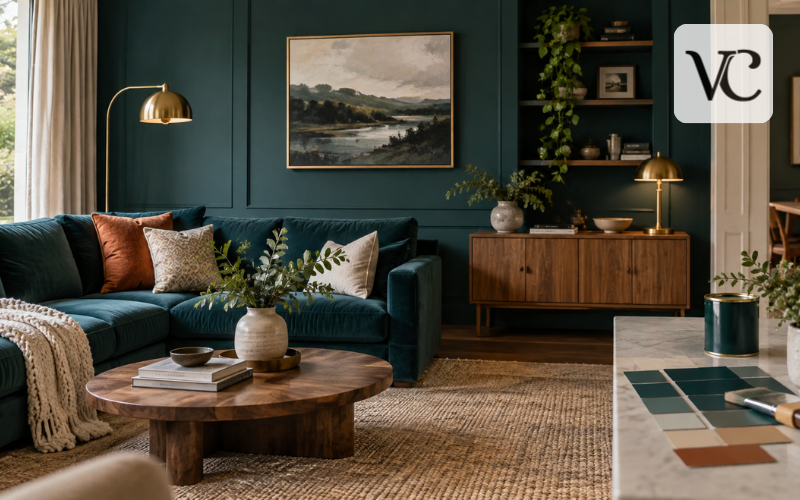
In bedrooms, dark teal can create a calm, enclosed feeling when paired with warm bedding and soft light. In living rooms, it works well with wood, cream upholstery, stone, brass, and textured fabrics. In bathrooms, it can provide strong contrast with white fixtures, pale stone, or warm metal finishes.
Small rooms do not automatically need light colors. Dark teal can look effective in a compact room if there is enough contrast and suitable lighting. In larger spaces, it may need warmer materials or lighter surfaces so the room does not feel flat or overly dark.
The surrounding materials matter as much as the wall color. Pale stone and light wood can make dark teal feel fresher, while walnut, dark marble, and aged brass create a deeper and more dramatic setting.
Dark Teal in Websites, Branding, and Graphic Design
Dark teal is useful in digital design because it can act as a strong background without feeling as severe as pure black. It can also work as an accent color for buttons, headings, icons, illustrations, logos, or social graphics.
Readability should come before appearance. For the commonly referenced #014D4E, ArtyClick reports a contrast ratio of about 9.6:1 with white and only about 2.2:1 with black. This means white text provides much stronger contrast on that specific dark teal shade.
For web accessibility, WCAG guidance calls for at least 4.5:1 contrast for normal text at Level AA, with a 3:1 threshold for qualifying large text. This makes contrast checking important whenever dark teal is used behind text.
Accessibility should not be judged by appearance alone. A combination that seems readable to one person may still be difficult for another. Designers should check actual contrast values for the exact colors they use.
Visual hierarchy also matters. A dark teal background can make pale text and bright accents stand out, but too many strong colors can weaken the effect. Test the design on different screens rather than trusting one monitor.
Wearing Dark Teal in Fashion and Everyday Styling
Dark teal works well in clothing because it has color without being as bright as many jewel tones. It can appear in dresses, jackets, shirts, knitwear, trousers, scarves, handbags, shoes, and jewelry.
For an easy combination, pair it with cream, camel, gray, or black. Navy creates a darker tonal look, while burgundy and rust add warmer contrast. Gold jewelry or hardware can bring warmth to dark teal and make it feel more polished.
The color can work across seasons. Cream and light neutrals keep it fresh, while camel, burgundy, rust, and heavier textures give it a warmer autumn or winter feel.
Fabric changes the appearance. Velvet may make dark teal look deeper and richer because of the way it reflects light. Satin can create brighter highlights. Cotton, wool, or matte fabrics may make the same shade look softer or more muted.
Lighting makes another difference. A garment that appears strongly blue-green under bright shop lights may look greener, darker, or softer outdoors. This is one reason clothing seen online may not perfectly match its appearance in person.
Dark Teal Hair: Shade, Undertones, and Care
Dark teal hair usually combines deep blue and green tones to create a bold, cool-looking color. Some formulas lean strongly green, while others appear closer to deep blue with a teal cast.
The starting hair color has a major effect on the final result. A lighter base usually shows teal more clearly, while darker hair may produce a subtler tint unless it has been lightened first. Existing warm, yellow, red, or orange tones can also change how the blue and green pigments appear.
Temporary colors generally wash out faster, while semi-permanent products can last longer but still fade over time. Longer-lasting coloring processes may involve stronger chemical treatment. Because hair condition and product formulas vary, an exact result cannot be guaranteed from a color chart alone.
To reduce fading, people often use cooler water, wash less frequently when practical, choose products intended for color-treated hair, and limit repeated heat exposure. Anyone planning major lightening or a dramatic color change should consider professional advice, especially if the hair is already processed or damaged.
The main point is to choose the actual shade rather than relying only on the words “dark teal.” A green-heavy formula can look quite different from a blue-heavy one even when both carry the same general color name.
Conclusion
Dark teal is a flexible deep blue-green that can feel calm, modern, dramatic, or refined depending on how it is used. #014D4E is a useful reference for the dark teal color code, but it is not the only shade that may carry the name.
The most important step is to choose the color for its real purpose. A web designer should work with exact digital values and contrast checks. Someone choosing dark teal paint should test a physical sample in the actual room. Fashion and hair choices should take material, lighting, undertones, and the starting color into account.
Dark teal also becomes easier to use when it is balanced with the right surrounding colors. Cream, warm neutrals, wood, metals, earthy oranges, and related blue-green shades can all create different effects.
Rather than relying only on the name “dark teal,” compare the actual shade, code, swatch, or sample. That small step makes it much easier to get the result you expect across screens, rooms, clothing, and creative projects.
FAQs
Is dark teal more blue or green?
Dark teal contains both blue and green. Some versions lean greener, while others have stronger blue undertones. The exact balance depends on the specific shade, color code, paint formula, or material.
What is the dark teal color code?
A widely referenced dark teal color code is #014D4E, with RGB values of 1, 77, 78. However, other color systems and brands may use slightly different codes for shades also called dark teal.
What colors look good with dark teal?
Dark teal works well with cream, beige, warm white, gold, brass, terracotta, rust, dusty pink, sage green, and natural wood. The best pairing depends on whether you want contrast or a softer look.
What is the difference between teal and dark teal?
Teal is generally brighter and lighter, while dark teal has greater depth and a more subdued appearance. Both belong to the blue-green family, but their exact saturation and undertones can vary.
Is dark teal a good paint color?
Dark teal can work well on accent walls, cabinets, furniture, or full rooms. Because lighting and paint finish affect its appearance, testing a physical sample in the actual space is recommended.
Disclaimer: This article on dark teal is provided by VogueCultures.co.uk for general informational and educational purposes only. Color appearance may vary between screens, paints, fabrics, lighting conditions, hair products, and materials. Any brand or product names mentioned are included only as factual examples or references. VogueCultures.co.uk is not promoting guest posts, paid placements, sponsored content, products, or advertising through this article. Readers should verify exact color codes, paint samples, product instructions, and suitability for their individual needs before making a final choice.
Enjoyed this article? Discover more helpful ideas and fresh inspiration on Vogue Cultures.